# A tibble: 1,571 × 6
    Unit Yard        Way Direct_Hours Total_Production_Days Total_Cost
   <dbl> <chr>     <dbl>        <dbl>                 <dbl>      <dbl>
 1     1 Bethlehem     1       870870                   244   2615849
 2     2 Bethlehem     2       831745                   249   2545125
 3     3 Bethlehem     3       788406                   222   2466811
 4     4 Bethlehem     4       758934                   233   2414978
 5     5 Bethlehem     5       735197                   220   2390643
 6     6 Bethlehem     6       710342                   227   2345051
 7     8 Bethlehem     8       668785                   217   2254490
 8     9 Bethlehem     9       675662                   196   2139564.
 9    10 Bethlehem    10       652911                   211   2221499.
10    11 Bethlehem    11       603625                   229   2217642.
# ℹ 1,561 more rows19 Polishing Your Graphics
19.1 Introduction
Visualization is not just about understanding data; it’s about telling a story. In this chapter, we’ll focus on enhancing your ggplot2 visualizations to make them clear, engaging, and actionable. Titles, labels, scales, facets, and themes can transform a good plot into an exceptional one by providing context, clarity, and visual appeal.
By the end of this chapter, you’ll learn to:
- Add meaningful titles, labels, and annotations to clarify your plots.
- Use scales to adjust axis ranges, labels, and formatting.
- Apply facets to compare groups effectively.
- Leverage themes to refine the aesthetics and presentation of your plots.
Adding clarity and aesthetic appeal to your visualizations helps reduce uncertainty, communicate insights effectively, and engage your audience. By refining your plots with the tools covered in this chapter, you can tailor them to meet the needs of various contexts, from exploratory data analysis to stakeholder presentations.
To demonstrate how these tools can add clarity and visual appeal, we return to the Liberty ship data first seen in Section 18.2. As before, we will explore the evolution of the relationship between Direct_Hours and Total_Production_Days as we seek to understand the remarkable improvements in productivity.
19.2 Labels and Titles
Titles, axis labels, and annotations provide context and make plots self-explanatory. Without them, even the most sophisticated visualizations risk being misunderstood.
Adding Titles and Labels
Adding a title and labels to axes is straightforward with the labs() function:
ggplot(liberty_ship_data,
       aes(x = Direct_Hours, y = Total_Production_Days)) +
  geom_point(aes(color = Yard)) +  # Color by shipyard
  labs(title = "Liberty Ship Production Time vs. Labor Hours",
       x = "Direct Labor Hours",
       y = "Total Production Days")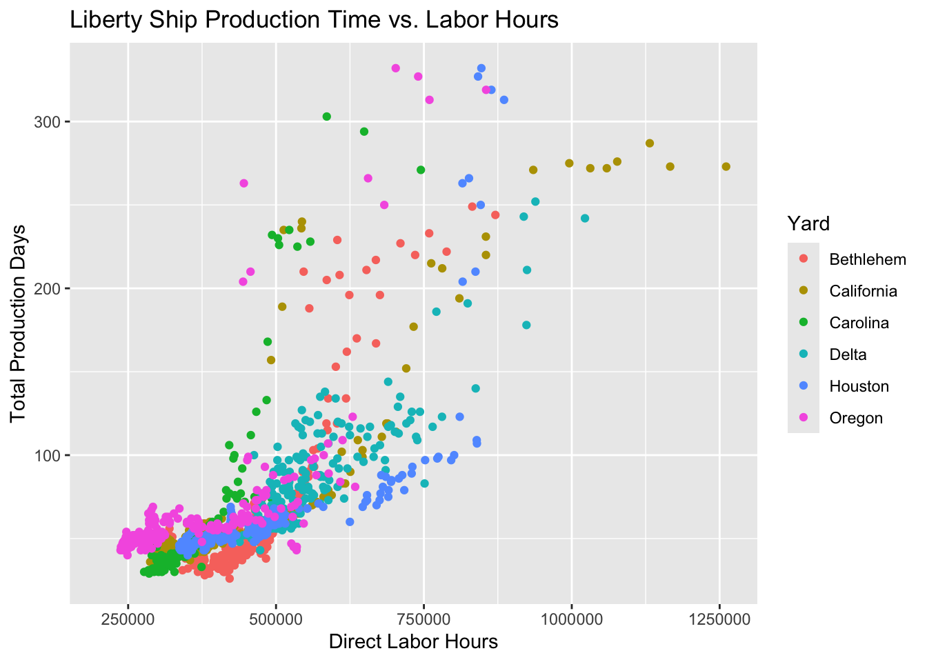
In this example:
title: Describes the plot’s purpose.xandylabels: Specify what each axis represents.
Exercise: Add Labels
Try it yourself
Customer responses about the protein-infused Muscle Cola were introduced in Chapter 18 in the exercise generating a scatter plot in Section 18.5.2. Using muscle_cola_data
Plot the relationship between willingness to pay
WTPand monthly consumptionQuantity.Map the variable
Gym_memberto color to show how gym membership affects the relationship between willingness to payWTPand consumptionQuantity.Map the length of the respondent’s workout
Workout_lengthto shape to show how workout length affects the relationship.Add title and axes labels
- Make the title “Willingness to Pay and Consume Muscle Cola”
- Make the x-axis “Willingness to Pay”
- Make the y-axis “Quantity Consumed”
Hint 1
Re-build your plot from layers beginning with specifying the dataset, then specifying aesthetic mapping of the x- and y-variables as well as the aesthetic mapping of gym membership to color. Inside a new aesthetic mapping in the point geometry, map the shape of the point to the length of the workout. Then declare the geometry to plot the data points. Then add the title and labels as instructed.
Hint 2
Inside the ggplot function, add the argument that the dataset is muscle_cola_data and the aesthetic mapping aes() the specifies that willingness to pay WTP is the x variable and Quantity is the y variable. Add an argument inside the aesthetic mapping that maps color to Gym_member. Then call the geom_point() function to plot the data as points (scatter plot). Add an aesthetic mapping of shape to Workout_length inside the geom_point(). Then call the labs() function using arguments title = "Willingness to Pay and Consume Muscle Cola", x = "Willingness to Pay", y = "Quantity Consumed".
  labs(title = "Willingness to Pay and Consume Muscle Cola",
       x = "Willingness to Pay",
       y = "Quantity Consumed"
       )
Fully worked solution:
As arguments to the ggplot() function, declare the data as muscle_cola_data and the aesthetic mapping as aes(x = WTP, y = Quantity, color = Gym_member). Then call the geom_point() function to plot the data as points. Then call the labs() function to add the title and axes labels.
1ggplot(muscle_cola_data,
2       aes(x = WTP, y = Quantity, color = Gym_member)) +
3  geom_point(aes(shape = Workout_length)) +
4  labs(title = "Willingness to Pay and Consume Muscle Cola",
5       x = "Willingness to Pay",
6 y = "Quantity Consumed")- 1
-
Call the
ggplot()function and specifymuscle_cola_dataas the data - 2
-
Specify that aesthetic mapping with
WTPplotted on the x-axis andQuantityon the y-axis, adding the mapping of color toGym_member - 3
-
Call the
geom_point()function to get a scatter plot of points and add the aesthetic that mapsshapeto theWorkout_length - 4
-
Call the
labs()function and specify thetitle - 5
- Specify the x-axis label
- 6
- Specify the y-axis label
Adding Annotations
Annotations can highlight key points or trends in the data. Use annotate() to add text or shapes directly to your plot. For example, high productivity was achieved when the shipyards could produce a ship with less direct labor in fewer days of production. We could say that ships that were built fast with less labor were in the “labor efficiency zone.” Let’s add an annotation to point out the ships built in this zone.
How annotate() Works
When you use annotate() with "text" in ggplot2, you’re adding a text annotation at a specific position in the plot. Here’s a breakdown of the key arguments:
annotate("text", ...): This specifies that you want to add a text annotation to the plot.x = ...andy = ...: Define the x- and y-coordinates for placing the annotation. These are in the same coordinate system as your plot (e.g., axis units).label = ...: The text string that you want to display as the annotation. For example, “Labor Efficiency Zone”.color = ...: Sets the text color. You can specify named colors (e.g., “black”, “red”) or use HEX codes (e.g., “#FF5733”).size = ...: Controls the size of the text, measured in points.fontface = ...(optional): Sets the font style. Options include “plain”, “bold”, “italic”, or “bold.italic”.angle = ...(optional): Rotates the text by a specified angle, useful for slanted or vertical annotations.hjustandvjust(optional): Adjust horizontal and vertical justification of the text. For instance,hjust = 0aligns the left edge of the text with the x-coordinate.
Here’s a complete example that uses multiple formatting options:
ggplot(liberty_ship_data, aes(x = Direct_Hours, y = Total_Production_Days)) +
  geom_point(aes(color = Yard)) +
  annotate("text",
           x = 300000,
           y = 25,
           label = "Labor Efficiency Zone",
           color = "blue",
           size = 6,
           fontface = "bold",
           angle = 30,
           hjust = 0) +
labs(title = "Annotated Liberty Ship Plot", x = "Direct Labor Hours", y = "Total Production Days") 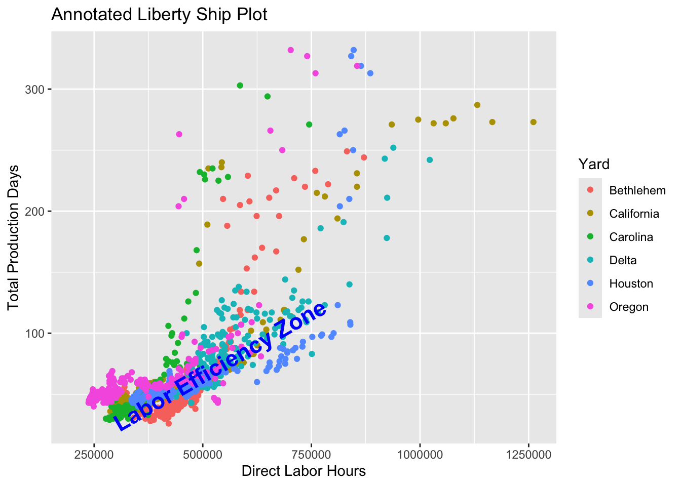
Annotations are powerful for storytelling, helping your audience focus on key insights.
19.3 Scales
Scales allow you to refine how data values are displayed, enhancing interpretability. Use them to:
- Adjust axis ranges and tick marks.
- Format labels, including currency or percentages.
- Apply transformations like logarithmic scales.
Axis Scales
The functions scale_x_continuous() and scale_y_continuous() allow you to fine-tune the appearance of axes in continuous plots. You can:
- Set limits: Define the minimum and maximum values displayed on the axis.
- Customize breaks: Specify the intervals at which tick marks and labels appear.
- Modify labels: Format the axis labels (e.g., add commas, currency symbols, or scientific notation).
This example demonstrates how to adjust the x-axis of a scatter plot to include commas in the axis labels for better readability. We’ll also customize the axis range and breaks.
ggplot(liberty_ship_data,
       aes(x = Direct_Hours, y = Total_Production_Days)) +
geom_point(aes(color = Yard)) +
  labs(
    title = "Liberty Ship Production Time vs. Labor Hours",
    x = "Direct Labor Hours (with commas)",
    y = "Total Production Days"
  ) +
  scale_x_continuous(
    limits = c(0, 1500000),                # Set the axis range
    breaks = seq(0, 1500000, 250000),     # Set breaks at 250,000 intervals
    labels = comma                        # Add commas to the labels
  )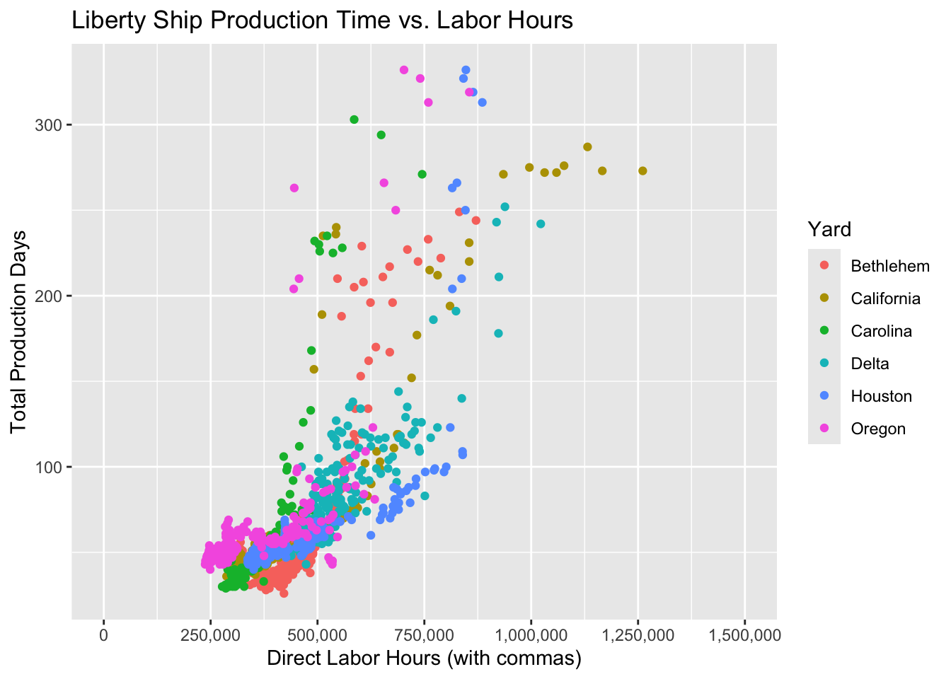
Explanation of the Code
limits:
- Restricts the x-axis range to values between 0 and 1,500,000.
- Any data points outside this range will be excluded from the plot.
breaks: Defines tick marks at every 250,000 interval, ensuring a clean and even distribution of labels.
labels: The comma function from the scales package formats the numbers with commas (e.g., 1,000,000 instead of 1000000), improving readability.
Formatting Scales with Currency
Financial data often benefits from currency formatting. Use the dollar() function from the scales library (scales::dollar()) for this purpose.
This example demonstrates how to adjust the y-axis of a scatter plot to include currency signs ($) in the axis labels. We will plot direct labor hours against total cost of production giving us currency in the y-axis:
ggplot(liberty_ship_data, aes(x = Direct_Hours, y = Total_Cost)) +
  geom_point(aes(color = Yard)) +
  scale_y_continuous(labels = scales::dollar_format()) +
  labs(title = "Cost of Liberty Ship Production",
       x = "Direct Labor Hours",
y = "Total Cost (in $)") 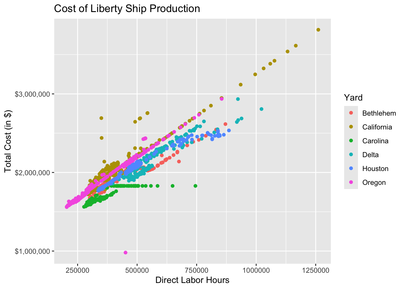
By formatting axes, you ensure that your audience interprets values correctly.
Recap of Scales:
scale_x_continuous()/scale_y_continuous(): Adjust axis ranges, breaks, and labels.scale_color_manual(): Manually assign specific colors to categories.scale_color_gradient(): Create color gradients for continuous data.scales::dollar(): Quickly formats axis labels as dollars.dollar_format(): Allows you to customize the currency symbol, add suffixes like “K” or “M”, and scale the values for better readability.- Other Currencies: You can use
dollar_format()for any currency by modifying the prefix argument (e.g., “€” or “£”).
Using scales allows you to fine-tune how your data is presented visually, giving you more control over the plot’s aesthetics. For example, currency formatting is a handy tool when dealing with financial data, making your plots clearer and more professional in entrepreneurial contexts.
Exercise: Add Currency Labels to the x-axis Scale
Try it yourself
Plot the relationship between willingness to pay
WTPand monthly consumptionQuantity.Map the variable
Gym_memberto color to show how gym membership affects the relationship between willingness to payWTPand consumptionQuantity.Map the length of the respondent’s workout
Workout_lengthto shape to show how workout length affects the relationship.Add title and axes labels
- Make the title “Willingness to Pay and Consume Muscle Cola”
- Make the x-axis “Willingness to Pay”
- Make the y-axis “Quantity Consumed”
Set the x-axis scale to be currency in dollars ($). Note that the
scaleslibrary is already loaded so the scale functions are available to you.
Hint 1
Re-build your plot from layers beginning with specifying the dataset, then specifying aesthetic mapping of the x- and y-variables as well as the aesthetic mapping of gym membership to color. Inside a new aesthetic mapping in the point geometry, map the shape of the point to the length of the workout. Then declare the geometry to plot the data points. Then add the title and labels. Then format the x-axis to have currency in dollars.
Hint 2
Inside the ggplot function, add the argument that the dataset is muscle_cola_data and the aesthetic mapping aes() the specifies that willingness to pay WTP is the x variable and Quantity is the y variable. Add an argument inside the aesthetic mapping that maps color to Gym_member. Then call the geom_point() function to plot the data as points (scatter plot). Add an aesthetic mapping of shape to Workout_length inside the geom_point(). Then call the labs() function using arguments title = "Willingness to Pay and Consume Muscle Cola", x = "Willingness to Pay", y = "Quantity Consumed". Then call the scale_x_continuous() function and specify the argument that the labels are dollar currency.
  labs(title = "Willingness to Pay and Consume Muscle Cola",
       x = "Willingness to Pay",
       y = "Quantity Consumed"
       )
Fully worked solution:
As arguments to the ggplot() function, declare the data as muscle_cola_data and the aesthetic mapping as aes(x = WTP, y = Quantity, color = Gym_member). Then call the geom_point() function to plot the data as points. Then call the labs() function to add the title and axes labels. Then call the scale_x_continuous() function to specify the x-axis scale labels to be dollar currency.
1ggplot(muscle_cola_data,
2       aes(x = WTP, y = Quantity, color = Gym_member)) +
3  geom_point(aes(shape = Workout_length)) +
4  labs(title = "Willingness to Pay and Consume Muscle Cola",
5       x = "Willingness to Pay",
6       y = "Quantity Consumed") +
7 scale_x_continuous(labels = dollar)- 1
-
Call the
ggplot()function and specifymuscle_cola_dataas the data - 2
-
Specify that aesthetic mapping with
WTPplotted on the x-axis andQuantityon the y-axis, adding the mapping of color toGym_member - 3
-
Call the
geom_point()function to get a scatter plot of points and add the aesthetic that mapsshapeto theWorkout_length - 4
-
Call the
labs()function and specify thetitle - 5
- Specify the x-axis label
- 6
- Specify the y-axis label
- 7
-
Call the
scale_x_continuous()function and specify thelabelsto bedollar.
19.4 Facets
Facets split data into subplots, making it easier to compare trends or relationships across groups.
Using facet_wrap()
The function facet_wrap() is used to create facets (small multiples) for a single variable. In the following example, we create a separate plot for each Yard to compare the relationship between Direct_Hours and Total_Production_Days across shipyards.
ggplot(liberty_ship_data,
       aes(x = Direct_Hours, y = Total_Production_Days)) +
  geom_point(aes(color = Yard)) +  # Color by shipyard
  labs(title = "Liberty Ship Production Time vs. Labor Hours",
       x = "Direct Labor Hours",
       y = "Total Production Days") +
  scale_x_continuous(labels = comma) +
  facet_wrap(~ Yard) +
  theme(axis.text.x = element_text(angle = 45, hjust = 1))  # Rotate x-axis labels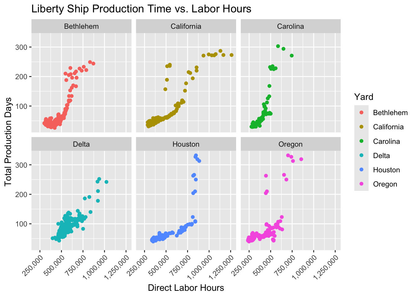
Here, facet_wrap(~ Yard) creates a separate panel for each shipyard, showing how the relationship between Direct_Hours and Total_Production_Days varies across shipyards.
Using facet_grid()
For two categorical variables, use facet_grid() to create a grid of subplots where rows and columns represent different variables:
ggplot(liberty_ship_data |> filter(Way < 5),
       aes(x = Direct_Hours, y = Total_Production_Days)) +
  geom_point(aes(color = Yard)) +
  facet_grid(Way ~ Yard) +
  labs(title = "Production Trends by Shipyard and Production Platform (Way)",
       x = "Direct Labor Hours", y = "Total Production Days") +
theme(axis.text.x = element_text(angle = 45, hjust = 1)) # Rotate x-axis labels 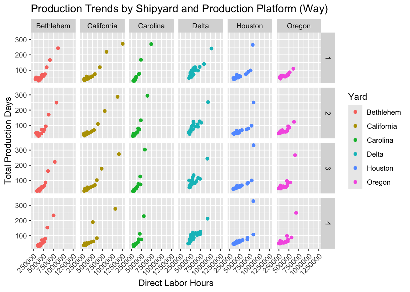
Here, facet_grid(Way ~ Yard) creates a grid of plots where each row corresponds to a different production platform (way) and each column corresponds to a production yard.
Faceting makes subgroup analysis intuitive, highlighting variations across categories.
Why Use Facets?
- Easy comparisons: Facets make it easy to compare the same relationship across different categories without overcrowding a single plot.
- Clarity: By splitting the data into smaller, separate plots, facets allow you to focus on specific subgroups of the data.
Faceting is a powerful tool in ggplot2 for visualizing complex relationships in your data by dividing it into more digestible pieces. It can be particularly helpful when comparing categorical variables or exploring subsets of the data.
Exercise: Create Facets to Isolate Relationships
Try it yourself
Plot the relationship between willingness to pay
WTPand monthly consumptionQuantity.Map the variable
Gym_memberto color to show how gym membership affects the relationship between willingness to payWTPand consumptionQuantity.Map the length of the respondent’s workout
Workout_lengthto shape to show how workout length affects the relationship.Add title and axes labels
- Make the title “Willingness to Pay and Consume Muscle Cola”
- Make the x-axis “Willingness to Pay”
- Make the y-axis “Quantity Consumed”
Set the x-axis scale to be currency in dollars ($)
Create facets to separate the effects of the relationship for the preferred drink
Drink_preferredof the respondents.
Hint 1
Re-build your plot from layers beginning with specifying the dataset, then specifying aesthetic mapping of the x- and y-variables as well as the aesthetic mapping of gym membership to color. Inside a new aesthetic mapping in the point geometry, map the shape of the point to the length of the workout. Then declare the geometry to plot the data points. Then add the title and labels. Then format the x-axis to have currency in dollars. Then wrap the plot facets by respondent drink preference.
Hint 2
Inside the ggplot function, add the argument that the dataset is muscle_cola_data and the aesthetic mapping aes() the specifies that willingness to pay WTP is the x variable and Quantity is the y variable. Add an argument inside the aesthetic mapping that maps color to Gym_member. Then call the geom_point() function to plot the data as points (scatter plot). 4. Add an aesthetic mapping of shape to Workout_length inside the geom_point(). Then call the labs() function using arguments title = "Willingness to Pay and Consume Muscle Cola", x = "Willingness to Pay", y = "Quantity Consumed". Then call the scale_x_continuous() function and specify the argument that the labels are dollar currency. Then call the facet_wrap() function and specify it to create facets for each Drink_preferred
facet_wrap(~ Drink_preferred)Fully worked solution:
As arguments to the ggplot() function, declare the data as muscle_cola_data and the aesthetic mapping as aes(x = WTP, y = Quantity, color = Gym_member). Then call the geom_point() function to plot the data as points. Then call the labs() function to add the title and axes labels. Then call the scale_x_continuous() function to specify the x-axis scale labels to be dollar currency. Then call the facet_wrap() function to specify the facets to be created and wrapped on Drink_preferrence.
1ggplot(muscle_cola_data,
2       aes(x = WTP, y = Quantity, color = Gym_member)) +
3  geom_point(aes(shape = Workout_length)) +
4  labs(title = "Willingness to Pay and Consume Muscle Cola",
5       x = "Willingness to Pay",
6       y = "Quantity Consumed") +
7  scale_x_continuous(labels = dollar) +
8 facet_wrap(~ Drink_preferred)- 1
-
Call the
ggplot()function and specifymuscle_cola_dataas the data - 2
-
Specify that aesthetic mapping with
WTPplotted on the x-axis andQuantityon the y-axis, adding the mapping of color toGym_member - 3
-
Call the
geom_point()function to get a scatter plot of points and add the aesthetic that mapsshapeto theWorkout_length - 4
-
Call the
labs()function and specify thetitle - 5
- Specify the x-axis label
- 6
- Specify the y-axis label
- 7
-
Call the
scale_x_continuous()function and specify thelabelsto bedollar. - 8
-
Call the
facet_wrap()function and specify the facets to be created forDrink_preferred.
19.5 Themes
Themes in ggplot2 control the non-data-related visual aspects of the plot, such as background color, gridlines, text size, and font. While the default theme in ggplot2 works well in many cases, customizing the theme can make your plot more suitable for reports, presentations, or other specific formats.
Default Theme: theme_gray()
The default theme in ggplot2 is theme_gray(), which uses a gray background and white gridlines. This is a good starting point, but you might want to change the theme to fit your needs.
ggplot(liberty_ship_data, aes(x = Direct_Hours, y = Total_Production_Days)) +
  geom_point(aes(color = Yard)) +  # Color by shipyard
  labs(title = "Liberty Ship Production Time vs. Labor Hours",
       x = "Direct Labor Hours",
       y = "Total Production Days") +
  scale_x_continuous(labels = comma) +
  theme_gray()
Customizing the Theme
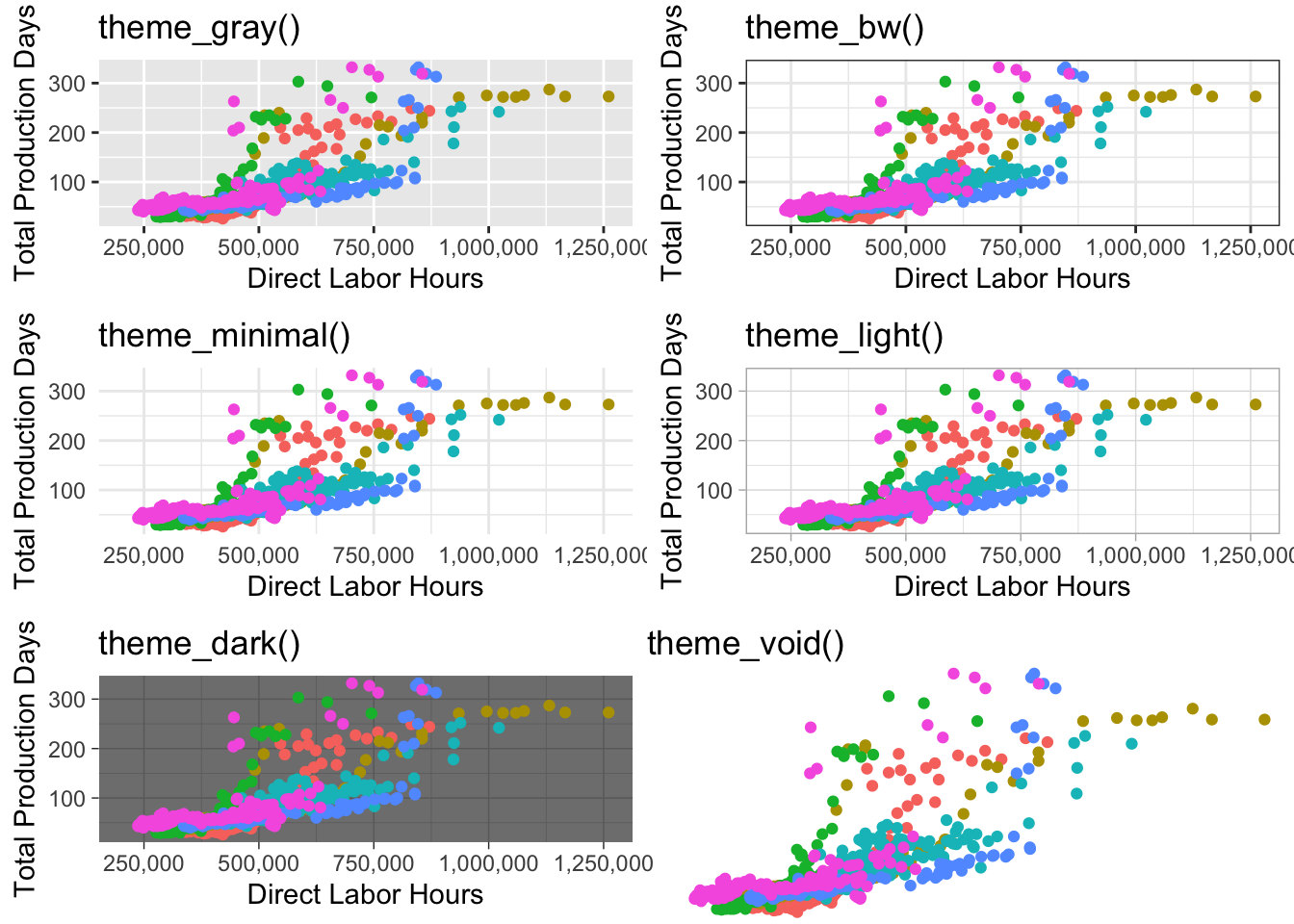
You can use several built-in themes to quickly change the appearance of your plot. For example:
theme_gray():Gray background color and white grid lines. Put the data forward to make comparisons easy. This is the default theme in ggplot.theme_bw(): White background and gray grid lines. May work better for presentations displayed with a projector.theme_light(): A theme with light grey lines and axes, to direct more attention towards the data.theme_dark(): Same astheme_lightbut with a dark background. Useful to make thin colored lines pop out.theme_minimal(): A clean, simple theme that removes unnecessary gridlines and backgrounds.theme_classic(): A traditional theme with only axis lines and no gridlines.theme_void(): A completely empty theme, useful for non-standard plots or creative visualizations.
Customizing Specific Theme Elements
In addition to using predefined themes, you can customize individual elements of the theme, such as the background, text size, or axis lines.
ggplot(liberty_ship_data, aes(x = Direct_Hours, y = Total_Production_Days)) +
  geom_point(aes(color = Yard)) +
  labs(title = "Liberty Ship Production: Custom Theme") +
  scale_x_continuous(labels = comma) +
  theme_minimal() +
  theme(
    plot.title = element_text(size = 16, face = "bold"),
    axis.title = element_text(size = 12),
    panel.grid.major = element_line(color = "gray", size = 0.5),
    panel.background = element_rect(fill = "white"),
    legend.position = "top"
  )
In this example, we use theme_minimal() as a base and customize:
plot.title: Adjusting the font size and boldness of the title.axis.title: Changing the font size of axis labels.panel.grid.major: Customizing the major gridlines.panel.background: Setting the background color.legend.position: Moving the legend to the top of the plot.
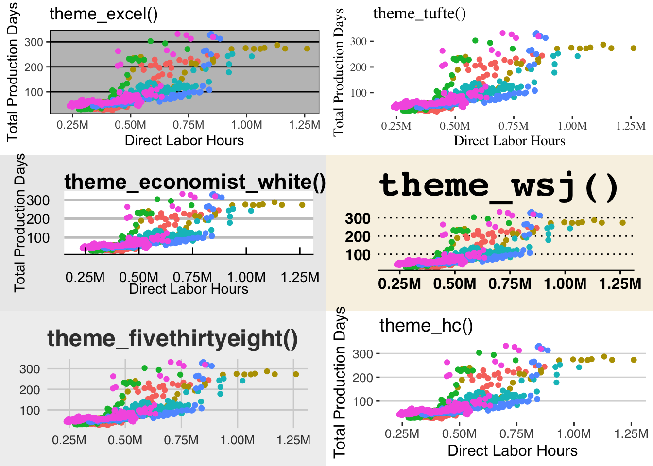
Using External Themes (ggthemes)
For professional aesthetics, you can use external packages like ggthemes to apply specialized themes, such as themes that mimic charts from professional organizations (e.g., The Economist, Wall Street Journal).
# install.packages("ggthemes") # Install and load ggthemes (if needed)
library(ggthemes)
ggplot(liberty_ship_data, aes(x = Direct_Hours, y = Total_Production_Days)) +
  geom_point(aes(color = Yard)) +
  labs(title = "Liberty Ship Production: Economist Theme",
       x = "Direct Labor Hours",
       y = "Total Production Days") +
  scale_x_continuous(labels = comma) +
  theme_economist()  # Apply a theme from ggthemes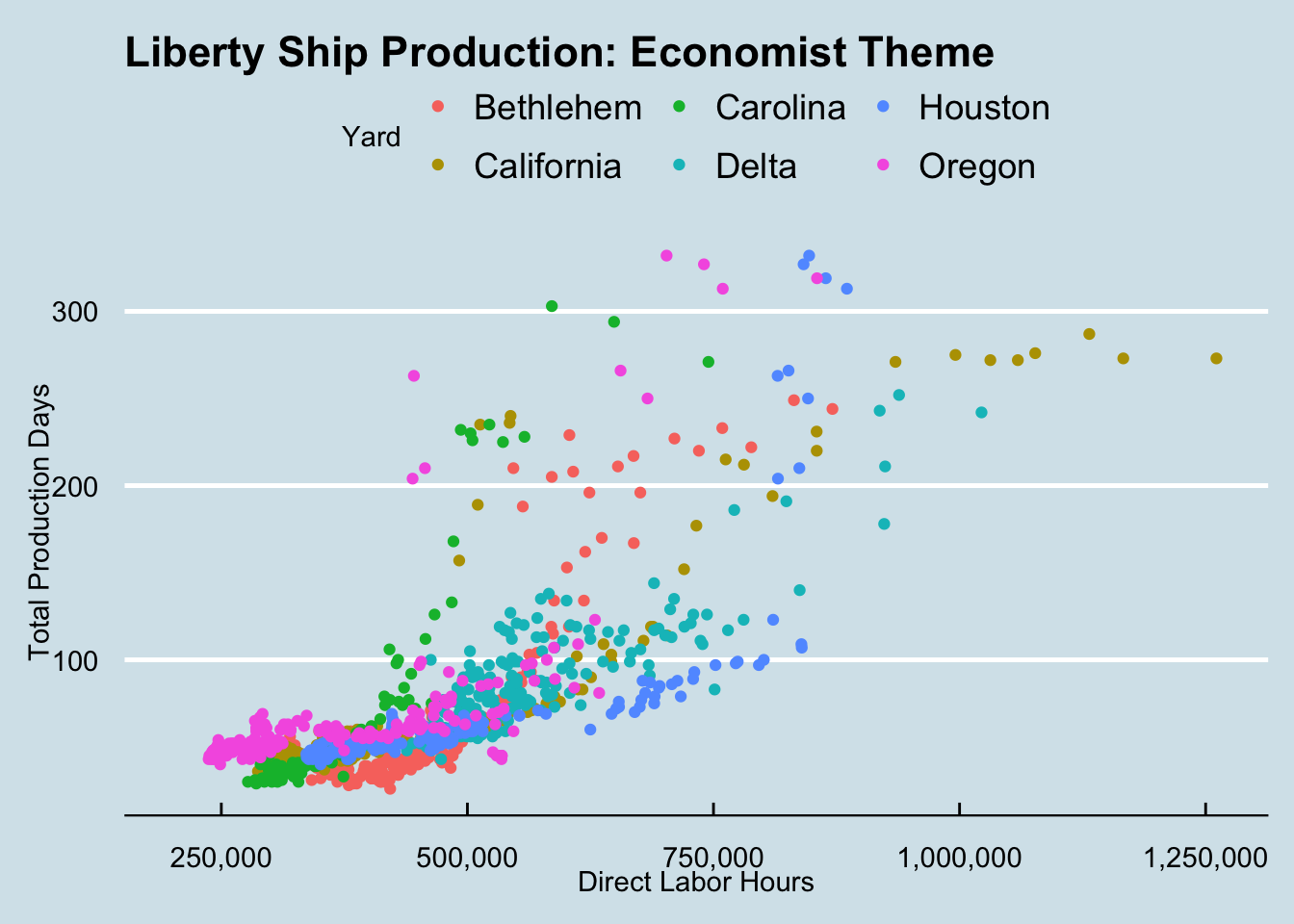
You can use several other themes from the ggthemes package to adopt their appearance. For example:
theme_excel(): theme mimicking default plot theme in Excel bridging the gap betweenggplot2and Exceltheme_tufte(): a minimalist theme adhering to the principles espoused by Edward Tufte who is mentioned abovetheme_economist(): theme based on the plots in the Economist magazinetheme_wsj(): theme based on plots in the Wall Street Journal with clean, professional visuals that mirror financial or business reportingtheme_fivethirtyeight(): modern chart theme often seen in political or sports analytics found in the popular data-driven news site FiveThirtyEighttheme_hc(): theme based on Highcharts JS
Why Use Themes?
- Consistency: Applying a consistent theme across multiple plots can give your visualizations a professional look.
- Readability: Themes help you control elements that make your plots easier to read, especially when presenting in different formats (e.g., reports, presentations).
- Customization: You can tailor your plot’s appearance to your audience or purpose by fine-tuning individual elements.
Recap of Themes:
- Built-in themes: ggplot2 offers several built-in themes like
theme_gray(),theme_minimal(),theme_classic(), and more. - External themes: Packages like
ggthemesprovide additional styles to make your plots look more professional or specialized. - Custom themes: You can customize individual elements of a theme, such as text size, gridlines, and backgrounds, to match your specific needs.
Exercise: Add a Theme
Try it yourself
Plot the relationship between willingness to pay
WTPand monthly consumptionQuantity.Map the variable
Gym_memberto color to show how gym membership affects the relationship between willingness to payWTPand consumptionQuantity.Map the length of the respondent’s workout
Workout_lengthto shape to show how workout length affects the relationship.Add title and axes labels
- Make the title “Willingness to Pay and Consume Muscle Cola”
- Make the x-axis “Willingness to Pay”
- Make the y-axis “Quantity Consumed”
Set the x-axis scale to be currency in dollars ($)
Drop the facet wrap to reduce complexity.
Create the plot in at least two themes other than the default
theme_gray(). Note thatggthemesis already loaded so you can choose from any themes in that library as well.
Hint 1
Re-build your plot from layers beginning with specifying the dataset, then specifying aesthetic mapping of the x- and y-variables as well as the aesthetic mapping of gym membership to color. Inside a new aesthetic mapping in the point geometry, map the shape of the point to the length of the workout. Then declare the geometry to plot the data points. Then add the title and labels. Then format the x-axis to have currency in dollars. Add a theme and evaluate your preferences for the appearance.
Hint 2
Inside the ggplot function, add the argument that the dataset is muscle_cola_data and the aesthetic mapping aes() the specifies that willingness to pay WTP is the x variable and Quantity is the y variable. Add an argument inside the aesthetic mapping that maps color to Gym_member. Then call the geom_point() function to plot the data as points (scatter plot). 4. Add an aesthetic mapping of shape to Workout_length inside the geom_point(). Then call the labs() function using arguments title = "Willingness to Pay and Consume Muscle Cola", x = "Willingness to Pay", y = "Quantity Consumed". Then call the scale_x_continuous() function and specify the argument that the labels are dollar currency. Call a theme_name() function to evaluate the appearance.
theme_name() # replace "name" with the name of your chosen themeFully worked solution:
As arguments to the ggplot() function, declare the data as muscle_cola_data and the aesthetic mapping as aes(x = WTP, y = Quantity, color = Gym_member). Then call the geom_point() function to plot the data as points. Then call the labs() function to add the title and axes labels. Then call the scale_x_continuous() function to specify the x-axis scale labels to be dollar currency. Then call a theme function. In this solution, we call theme_fivethirtyeight.
1ggplot(muscle_cola_data,
2       aes(x = WTP, y = Quantity, color = Gym_member)) +
3  geom_point(aes(shape = Workout_length)) +
4  labs(title = "Willingness to Pay and Consume Muscle Cola",
5       x = "Willingness to Pay",
6       y = "Quantity Consumed") +
7  scale_x_continuous(labels = dollar) +
8 theme_fivethirtyeight()- 1
-
Call the
ggplot()function and specifymuscle_cola_dataas the data - 2
-
Specify that aesthetic mapping with
WTPplotted on the x-axis andQuantityon the y-axis, adding the mapping of color toGym_member - 3
-
Call the
geom_point()function to get a scatter plot of points and add the aesthetic that mapsshapeto theWorkout_length - 4
-
Call the
labs()function and specify thetitle - 5
- Specify the x-axis label
- 6
- Specify the y-axis label
- 7
-
Call the
scale_x_continuous()function and specify thelabelsto bedollar. - 8
-
Call the
facet_wrap()function and specify the facets to be created forDrink_preferred.
19.6 Summary
By mastering these tools, you can transform your visualizations into powerful storytelling devices:
- Titles and Labels: Add clarity and context.
- Scales: Refine axis ranges, labels, and formatting.
- Facets: Simplify subgroup comparisons.
- Themes: Create visually appealing and consistent plots.
These layers are not strictly necessary for building a plot but are essential for crafting clear and compelling visualizations. The ability to clearly and effectively communicate your data insights through visualization is a critical skill in entrepreneurship and beyond.
As you move forward, continue experimenting with different combinations of geoms, aesthetics, and themes to refine your plots for specific needs. Now it’s your turn to apply these techniques and see the difference they make!