# A tibble: 100 × 4
     age spending product_interest region
   <dbl>    <dbl> <chr>            <chr>
 1    33      495 Fashion          East
 2    18      458 Fashion          North
 3    32      491 Health           South
 4    30      420 Fashion          South
 5    85      664 Fashion          East
 6    35      533 Fashion          East
 7    31      526 Health           South
 8    14      350 Fashion          South
 9    24      471 Health           East
10    NA      424 Fashion          South
# ℹ 90 more rows26 Univariate EDA: Visualization
The greatest value of a picture is when it forces us to notice what we never expected to see.— John Tukey
26.1 Introduction
Univariate Exploratory Data Analysis (EDA) examines individual variables to uncover their properties, validate data quality, and gain insights. By focusing on one variable at a time, we can identify patterns, detect anomalies, and ensure the data is ready for deeper analysis. For entrepreneurs, univariate EDA provides clarity on customer demographics, product feedback, and business performance metrics.
EDA generally follows a two-step process:
- Visualization: Start by examining the variable’s distribution through plots like histograms or box plots.
- Statistical Measurement: Follow up with descriptive statistics like mean, median, and variance to quantify its characteristics.
As discussed in Exploring Data, this approach applies to all forms of EDA. In this chapter, we’ll focus on visual exploration of a single variable to understand the distribution, detect data quality issues, and interpret its properties effectively. In the following Chapter 27, we’ll focus on exploring the distribution of variables using descriptive statistics.
26.2 Visualizing Distributions
In exploratory data analysis, understanding the distribution of a variable is essential, but we rarely know what this distribution looks like until we visualize it. By using visualization tools in R, such as those available in ggplot2, we can gain simple yet powerful insights into data patterns, including clustering, spread, and unusual values. Visualization helps reveal whether data tends to follow a normal distribution, has skewness, or shows other unique characteristics.
26.3 Demonstration Data: UrbanFind
Consider UrbanFind, a startup that specializes in curating personalized recommendations for city dwellers in several areas of their lives:
Tech Gadgets: Recommendations for the latest gadgets and devices that enhance convenience and connectivity in a fast-paced city life, such as smart home devices, wearable tech, and productivity tools.
Fashion: Curated fashion items and accessories that align with urban styles and seasonal trends, helping city dwellers look their best in a competitive, image-conscious environment.
Outdoor Activities: Gear and suggestions for outdoor activities that are accessible even in or near urban settings—like urban hiking, weekend getaways, and fitness equipment for both outdoor and indoor use.
Health and Wellness Products: Products focused on personal well-being, including fitness equipment, nutritional supplements, and relaxation tools to counterbalance the stresses of urban life.
These recommendations aim to provide city residents with tailored options that fit their lifestyle and preferences, whether they’re looking to upgrade their tech, update their wardrobe, stay active, or improve their wellness. By analyzing customer data, UrbanFind can better understand which areas resonate most with their audience and refine their product offerings and marketing strategies accordingly.
By examining single variables—like customer age, income level, or product rating—UrbanFind can answer foundational questions:
- Who is the customer?
- What price range can they afford?
- How satisfied are they with existing products?
These insights, while simple, guide strategic decisions and set the stage for deeper analysis.
Variables in UrbanFind’s Data
UrbanFind conducted a survey to gather insights into customer demographics, spending habits, and interests. The dataset we’re working with contains responses from 100 survey participants who are representative of UrbanFind’s potential customer base. Each row is an observation, representing the responses of one unique respondent, with the following variables captured:
Age: The age of the customer in years. Age is an important demographic factor for UrbanFind, as different age groups may have distinct preferences for technology, fashion, or outdoor activities.
Spending: The amount (in dollars) each customer reported spending on lifestyle-related products in the past month. This includes items like tech gadgets, health products, and outdoor gear. UrbanFind aims to understand the range of spending to help design product bundles and set price points.
Product Interest: The product category the customer is most interested in, chosen from four options: Tech, Fashion, Outdoors, and Health. This helps UrbanFind determine which product lines to prioritize for marketing and inventory.
Region: The geographic region where each customer lives, categorized into North, South, East, and West. This variable provides insights into potential regional differences in product preferences and spending behaviors.
Each of these variables gives us a unique lens through which to view the customer base. By examining them individually, we gain insights that will inform how UrbanFind can create targeted marketing strategies, set appropriate price points, determine which products resonate most with their customers, and tailor its offerings to meet customer needs,
Preview of the UrbanFind customer_data Dataset
Here’s a preview of the customer_data dataset. Notice how the values of each variable vary across observations. In other words, age, spending, product_interest, and region are all variables that provide different types of information.
26.4 Histograms for Continuous Variables
A histogram shows the frequency of values within specified ranges (or “bins”) along the x-axis, making it ideal for visualizing the shape of the data. Histograms allow us to observe clustering patterns, skewness, and whether the distribution has one peak or multiple peaks.
For example, if we were examining a variable representing the price of items in a store, a histogram could reveal if prices tend to cluster around certain points or if there’s a broader spread. In the following demonstration, you’ll see how histograms effectively depict the distribution of values within a dataset.
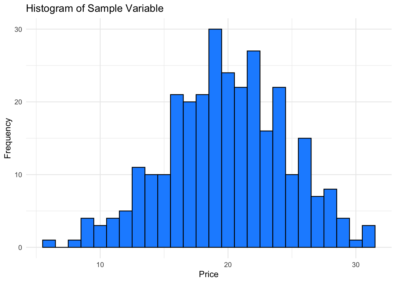
Here the histogram shows the frequency distribution of our sample variable, giving insight into how values are spread and where they tend to cluster.
26.5 Box Plots for Continuous Variables
A box plot provides a summary of data based on quartiles, helping us visualize the statistical measures of spread, center, and outliers within a numeric variable. The box represents the interquartile range (IQR), covering the middle 50% of the data. The whiskers extend to the minimum and maximum values within 1.5 times the IQR, while any points beyond the whiskers are displayed as individual outliers.
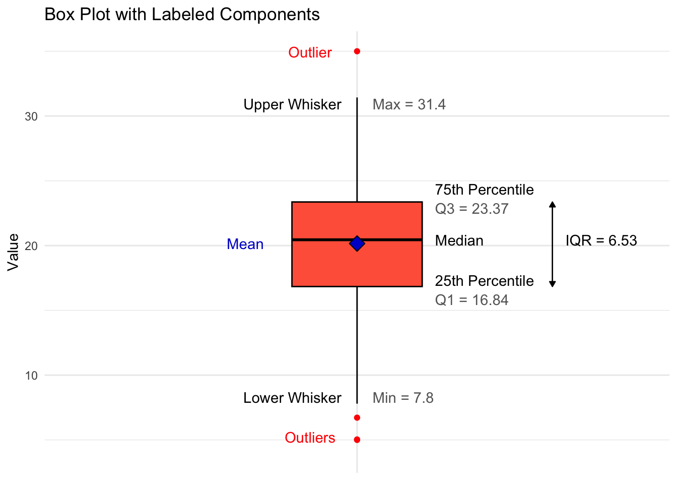
This annotated box plot shows the key components, helping us understand the distribution’s spread and identify any potential outliers.
26.6 Bar Plots for Categorical Variables
While histograms are ideal for visualizing the distribution of continuous variables, bar plots are the go-to tool for visualizing categorical variables. A categorical variable represents distinct categories, with each observation falling into one category. Examples include gender, product type, or region.
In a bar plot, each bar represents a category, and the height of the bar shows the count (or percentage) of observations in that category. This visualization provides insights into the relative frequency of each category, allowing us to compare categories at a glance.
   Clothing Electronics       Games   Groceries      Health     Outdoor
25 45 38 89 44 23 
In this bar plot, each bar’s height shows the frequency of sales in each region. The plot highlights which purchase categories receive the most spending, helping us identify potential areas for business expansion or targeted marketing.
26.7 Demonstration: Exploring Unknown Distributions
When we encounter new data, we often don’t know the underlying distribution of each variable. Visualizations like histograms and box plots make it possible to quickly uncover patterns, shapes, and unique characteristics of the data that may not be obvious from just inspecting raw values.
In this demonstration, we’ll use a dataset of purchase_data that contains three different variables with distinct distributions that are initially unknown. The variables are product_price, customer_age, and purchase_frequency. We’ll first inspect the dataset to see the raw data and then visualize each variable individually to reveal its shape.
# A tibble: 6 × 3
  product_price customer_age purchase_frequency
          <dbl>        <dbl>              <dbl>
1          63.7         20.4               43.3
2          44.4         20.8               44.7
3          53.6         27.1               35.3
4          56.3         26.2               38.8
5          54.0         33.8               33.4
6          48.9         21.3               44.2
The head() of the dataset gives a preview of raw values, but doesn’t reveal much about the distributions. Since the distributions of product_price, customer_age, and purchase_frequency are unknown, lets begin our exploration of the data by visualizing the variables with histograms.
Product Price
To plot the histogram of product_price, we following the grammar of graphics by
- calling the
ggplotfunction, - specifying the dataset
purchase_data, and - specifying the aesthetic mapping
x = product_price.
To create a basic plot in
ggplot2, you only need to specify the data and the mapping. For example, when creating histograms, bar charts, and box plots, we typically map only thexaesthetic to the variable of interest. While this demonstration includes custom colors for aesthetics, the simplestggplotonly requires you to declare the data and mapping.
# Plotting the normal distribution for product price
ggplot(purchase_data, aes(x = product_price)) +
  geom_histogram(binwidth = 2,
                 fill = "royalblue",
                 color = "black") +
  labs(title = "Distribution of Product Prices",
       x = "Price",
       y = "Frequency") +
  theme_minimal()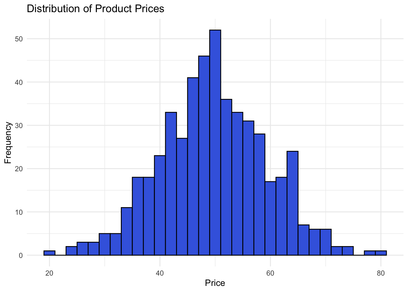
Customer Age
Next, let’s visualize customer_age with the same grammar of graphics code.
# Plotting the unknown distribution for customer age
ggplot(purchase_data, aes(x = customer_age)) +
  geom_histogram(binwidth = 5,
                 fill = "#7B3294",
                 color = "black") +
  labs(title = "Distribution of Customer Ages",
       x = "Customer Age",
       y = "Frequency") +
  theme_minimal()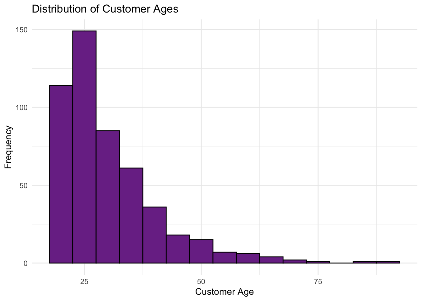
For customer_age, we see a right-skewed distribution where most values are lower, with a few exceptionally high outliers (such as older customers).
Tip: When exploring a new distribution, it’s often helpful to try different binwidths in your histogram. Adjusting the binwidth can uncover finer details or highlight broader trends in the data, providing a clearer picture of its underlying shape. For example, with a binwidth of 10, the histogram of
customer_ageappears to peak at age = 0, losing one of the key attributes of a skewed distribution.
# Plotting the unknown distribution for customer age
ggplot(purchase_data, aes(x = customer_age)) +
  geom_histogram(binwidth = 10,
                 fill = "#7B3294",
                 color = "black") +
  labs(title = "Distribution of Customer Ages",
       x = "Customer Age",
       y = "Frequency") +
  theme_minimal()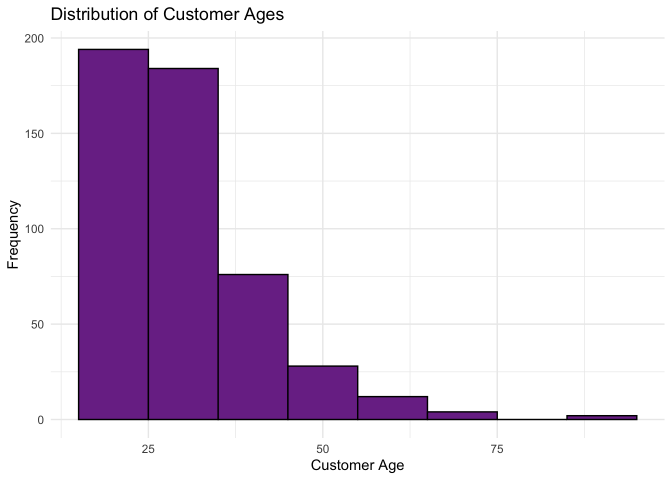
Purchase Frequency
Finally, we’ll plot purchase_frequency as we did for the previous two variables.
# Plotting the bimodal distribution for purchase frequency
ggplot(purchase_data, aes(x = purchase_frequency)) +
  geom_histogram(binwidth = 2,
                 fill = "mediumseagreen",
                 color = "black") +
  labs(title = "Distribution of Purchase Frequency",
       x = "Purchase Frequency",
       y = "Frequency (Count)") +
  theme_minimal()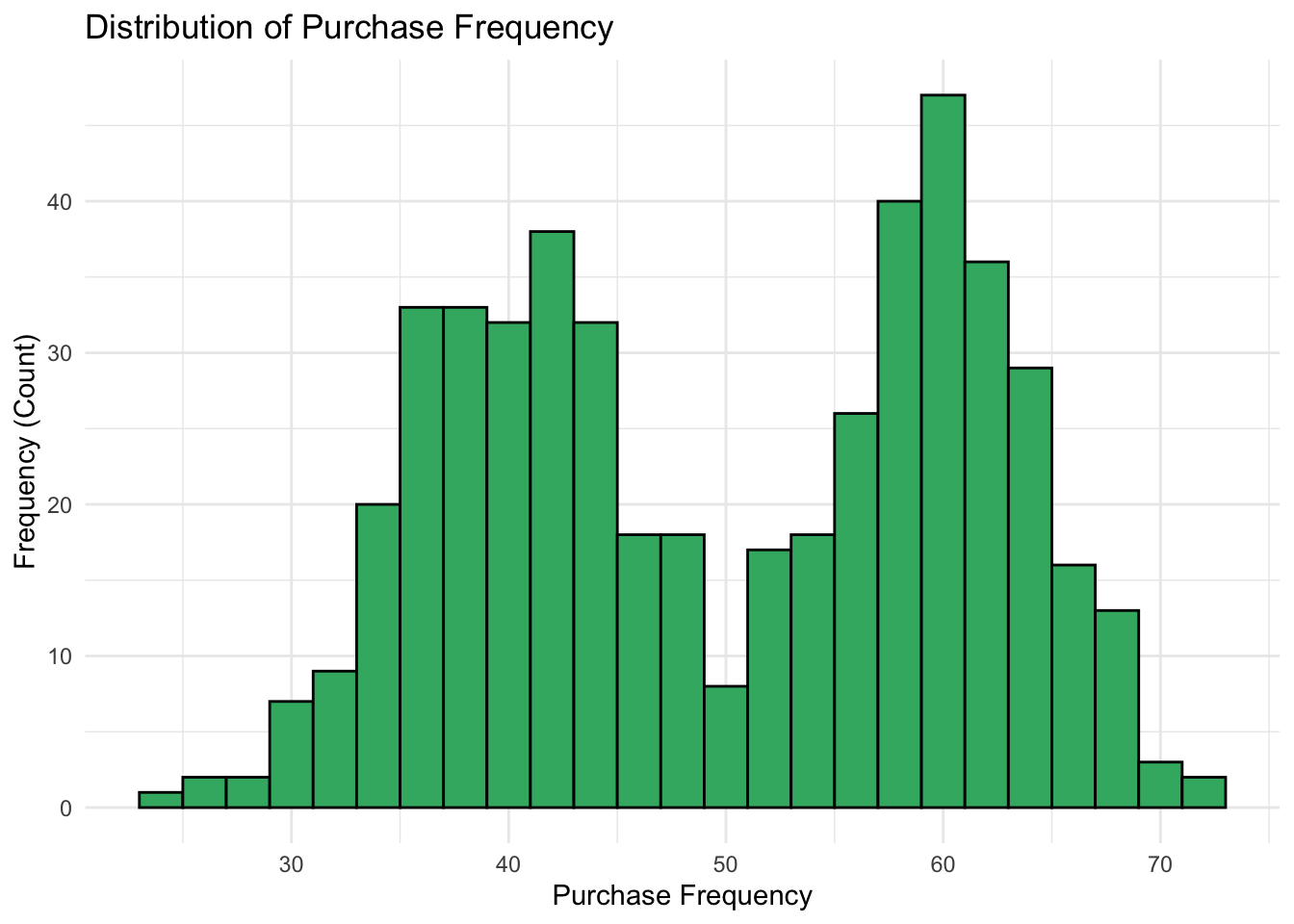
26.8 Exercise: Visualizing Distributions
Try it yourself:
In a dataset named distribution_data, data for a right-skewed variable named skewed_variable is found together with a bimodal variable named bimodal_variable. Visualize the distributions of these variables using a histograms. Compare the shapes to what you would expect from each distribution type.
Hint 1
Build your histogram plot using the grammar of graphics by declaring the data, specifying the aesthetic mapping (a histogram maps a variable to the x-axis only), and calling the geometry (a histogram uses the geom_histogram() function). Note that you can specify the binwidth (the span of the x-axis covered by one bar of the histogram), fill (the color of the bars of the histogram), and color (the color of the borders of the bars).
Hint 2
For the skewed distribution:
- Call the
ggplot()function - Specify the data as
distribution_data - Map the aesthetic with
x = skewed_variable
- Specify the geometry as
geom_histogram - [optional] Specify
binwidth,fill, andcoloras you like
- Call the
For the bimodal distribution:
- Call the
ggplot()function - Specify the data as
distribution_data - Map the aesthetic with
x = bimodal_variable - Specify the geometry as
geom_histogram - [optional] Specify
binwidth,fill, andcoloras you like
- Call the
geom_histogram(binwidth = 1) Fully worked solution:
For the distribution of
skewed_variable:- Call the
ggplot()function - Specify the data as
distribution_data - Specify the aesthetic mapping as
x = skewed_variable - Specify the geometry as
geom_histogram - [optional] Specify
binwidth,fill, andcoloras you like
- Call the
For the distribution of
bimodal_variable:- Call the
ggplot()function - Specify the data as
distribution_data - Specify the aesthetic mapping as
x = bimodal_variable
- Specify the geometry as
geom_histogram - [optional] Specify
binwidth,fill, andcoloras you like
- Call the
1ggplot(distribution_data,
2       aes(x = skewed_variable)) +
3  geom_histogram(binwidth = 2,
4                 fill = "royalblue",
5                 color = "black")

ggplot(distribution_data,
       aes(x = bimodal_variable)) +
  geom_histogram(binwidth = 0.5,
                 fill = "royalblue",
color = "black")- 1
-
Call the
ggplot()function and specifypurchase_data - 2
-
Specify that aesthetic mapping with
skewed_variableorbimodal_variableplotted on the x-axis - 3
-
Call the
geom_histogram()function to get a histogram of the distributions [optional] and specify thebinwidth, - 4
-
fill, - 5
-
color, or other aesthetics ofgeom_histogram()
26.9 Conclusion
Data visualization is an essential tool in exploratory data analysis. Each type of plot provides unique insights, depending on whether the data is continuous or categorical. The following table outlines commonly used visualization types, along with their purposes and suitability for continuous or categorical data.
| Visualization Type | Description | Continuous | Categorical | Use Case |
|---|---|---|---|---|
| Histogram | Shows frequency distribution of values in bins | ✅ | ❌ | Distribution Shape, Outlier Detection |
| Box Plot | Displays median, quartiles, and potential outliers | ✅ | ❌ | Spread, Outliers |
| Density Plot | Smooth curve showing data density over continuous range | ✅ | ❌ | Distribution Shape |
| Bar Chart | Shows count or proportion of each category | ❌ | ✅ | Frequency of Categorical Values |
| QQ Plot | Plots data against a normal distribution | ✅ | ❌ | Normality Check |
Effective data visualization is the cornerstone of univariate exploratory data analysis, transforming raw data into actionable insights. By using tools like histograms, box plots, and bar charts, we gain an intuitive understanding of a dataset’s distribution, variability, and potential anomalies. These visual tools allow us to identify patterns, such as skewness or clustering, and spot outliers that might require further investigation.
Understanding distribution shape allows us to make better data-driven decisions:
- Detecting Skew: Skewness tells us if a variable’s distribution leans towards higher or lower values. For instance, if product prices are right-skewed, most products are affordable, but a few are premium-priced.
- Identifying Outliers: Box plots make it easy to spot outliers. Outliers could indicate data errors or valuable insights, like a product that sells exceptionally well or poorly.
- Assessing Variability: Histograms and box plots help in quickly visualizing data spread, giving insight into whether values cluster tightly around the mean or are widely dispersed.
For entrepreneurs, these visualizations can answer critical questions like:
- Are customer purchases concentrated around specific price points?
- Do certain product categories dominate sales volume?
- Is variability in spending consistent across different regions?
Visualization not only simplifies complex datasets but also facilitates communication of insights to stakeholders, enabling data-driven decision-making. As you progress in EDA, remember that every visualization should serve a purpose: to clarify the data and support your decisions.
Looking ahead, statistical measures will deepen your understanding of the patterns observed visually, providing numerical evidence to complement these initial insights.