# A tibble: 1,571 × 6
    Unit Yard        Way Direct_Hours Total_Production_Days Total_Cost
   <dbl> <chr>     <dbl>        <dbl>                 <dbl>      <dbl>
 1     1 Bethlehem     1       870870                   244   2615849
 2     2 Bethlehem     2       831745                   249   2545125
 3     3 Bethlehem     3       788406                   222   2466811
 4     4 Bethlehem     4       758934                   233   2414978
 5     5 Bethlehem     5       735197                   220   2390643
 6     6 Bethlehem     6       710342                   227   2345051
 7     8 Bethlehem     8       668785                   217   2254490
 8     9 Bethlehem     9       675662                   196   2139564.
 9    10 Bethlehem    10       652911                   211   2221499.
10    11 Bethlehem    11       603625                   229   2217642.
# ℹ 1,561 more rows18 Grammar of Graphics
18.1 Introduction
The Grammar of Graphics framework in ggplot2 breaks down a plot into modular layers, making it a powerful tool for building flexible and customizable visualizations. Each layer represents a component of the plot, allowing you to incrementally refine your visualizations.
In this chapter, we focus on the core components of the grammar of graphics:
- Data: The dataset being visualized.
- Aesthetic mappings (
aes()): Mapping variables to visual properties (e.g., axes, color, size). - Geometric objects (
geom_*()): The shapes that represent the data (e.g., points, lines, bars).
In the next chapter (Chapter 19), we will cover some advanced topics that add clarity and visual appeal in additional layers such as labels, titles, scales, facets, and themes.
18.2 Demonstration Data: Production of Liberty Ships
Let’s walk through a simple example of how ggplot2 works by exploring data from the production of Liberty ships. During World War II, the U.S. embraced the challenge of rapidly building supply ships to support the Allied war effort. To address this, Liberty ships were developed to be a quick and cost-effective solution. Starting with an inexperienced workforce, the U.S. Maritime Commission eventually produced over 2,700 Liberty ships in just five years. Sometimes referred to as the “miracle of the Liberty ship,” the time to build one ship was reduced from 244 days to just 42 days by the end of the war, playing a crucial role in the war effort by maintaining supply lines across the Atlantic.
There are 18 variables in the Liberty ship dataset so we will select just a few to focus on visualization of productivity:
Unit: sequential number of ships produced at each ship yardYard: location of the shipyard that built the shipWay: Numbered production platform where a ship is builtDirect_Hours: the total direct labor hours spent on constructing each shipTotal_Production_Days: the total number of days required to produce and deliver a shipTotal_Cost: the total cost of producing a ship
We’ll use these variables to create scatter plots and explore their relationships between Total_Production_Days ( the total number of days required to build and deliver a ship) and Direct_Hours (the total direct labor hours required to build each ship).
18.3 Specify the Data
Every plot begins with a dataset. In ggplot2, you specify the dataset using the data argument within the ggplot() function.
ggplot(liberty_ship_data)
At this point, we’ve specified that we want to explore the Liberty ship dataset, but we haven’t yet told ggplot() which variables we want to plot, so nothing is shown. The plot remains an empty canvas until we declare which variables to use in the plot.
18.4 Map the Aesthetics
Aesthetic mappings in ggplot() define how variables in your dataset are visually represented in the plot. The simplest form of aesthetic mapping is to declare which variable will be placed on the x-axis and which will be placed on the y-axis. This is done using the aes() function (short for “aesthetics”).
In this example, we will map Direct_Hours to the x-axis and Total_Production_Days to the y-axis:
ggplot(liberty_ship_data,
       aes(x = Direct_Hours,
           y = Total_Production_Days))
Explanation
x = Direct_Hours: Maps theDirect_Hoursvariable to the x-axis.y = Total_Production_Days: Maps theTotal_Production_Daysvariable to the y-axis.
Interpretation
Now, the plot is starting to take shape. Direct_Hours is mapped to the x-axis, with a range automatically set from 0 to around 1,250,000, reflecting the range of direct labor hours in the dataset. Similarly, Total_Production_Days is mapped to the y-axis, with a range from 0 to around 350, based on the values in that variable.
At this point, the axes are scaled, but we still don’t see any data points because we haven’t added any geometric objects to represent the data visually.
18.5 Add Geometric Objects
Geometric objects define the shapes used to represent your data (e.g., points, lines, bars). Each geom is added as another layer to the base ggplot() object.
In this case, we will use geom_point() to add a layer of points to the plot, where each point represents the production of a single ship:
ggplot(liberty_ship_data,
       aes(x = Direct_Hours, y = Total_Production_Days)) +
  geom_point()
This plot uses geom_point() to create a scatter plot where each point represents the Direct_Hours and Total_Production_Days of a Liberty ship.
Exercise: Basic Scatter Plot
Try it yourself
Muscle Cola Customer Data
Muscle Cola is a unique product designed to meet the needs of fitness enthusiasts looking to recover after a workout while enjoying a refreshing beverage. Combining 20 grams of protein with the taste of a classic diet cola, Muscle Cola offers a convenient solution for those who want both protein replenishment and a refreshing drink but may not have the appetite for two separate items. With zero calories, zero sugar, zero fat, and zero carbs, Muscle Cola provides a guilt-free option for post-workout recovery and refreshment.
This dataset represents customer responses on their willingness to consume Muscle Cola, including data on preferred workout routines, demographic characteristics, and willingness to purchase at various price points. The goal is to explore customer preferences and understand how factors like workout frequency and age influence potential demand, providing insights for informed decision-making and product positioning.
Dataset Structure
Customer Preferences:
Gym_preference: Indicates whether the respondent prefers a gym workout, another form of exercise, or both.Gym_member: Specifies whether the respondent is a gym member (“Yes”/“No”).Gym_freq: Numeric value representing the average number of times per week the respondent goes to the gym, ranging from occasional to daily attendance.Protein_importance: Likert-scale response indicating how important protein intake is to the respondent, ranging from “Below Average” to “Above Average”.
Customer Demand:
Price: Specifies a series of prices at which respondents stated the quantity they would consumerQuantity: Quantities that respondents would consume at different prices per month.
Demographics:
Gender: Gender of the respondent.Age: Numeric value indicating the respondent’s age.Weight: The respondent’s weight in pounds, which may be relevant for understanding protein needs.
Generate a scatter plot of the willingness to pay of the respondents WTP in the x-axis and the number of servings they would consume per month Quantity in the y-axis.
Hint 1
Build your plot from layers beginning with specifying the dataset, then specifying aesthetic mapping of the x- and y-variables, then declaring the geometry to plot the data points.
Hint 2
Inside the ggplot function, add the argument that the dataset is muscle_cola_data and the aesthetic mapping aes() the specifies that willingness to pay WTP is the x variable and Quantity is the y variable. Then call the geom_point() function to plot the data as points (scatter plot).
aes(x = WTP, y = Quantity)Fully worked solution:
As arguments to the ggplot() function, declare the data as muscle_cola_data and the aesthetic mapping as aes(x = WTP, y = Quantity). Then call the geom_point() function to plot the data as points.
- 1
-
Call the
ggplot()function and specifymuscle_cola_dataas the data - 2
-
Specify that aesthetic mapping with
WTPplotted on the x-axis andQuantityon the y-axis - 3
-
Call the
geom_point()function to get a scatter plot of points
Available Geometric Objects
ggplot2 provides a wide variety of geometric objects, or geoms, that define how data is visually represented in a plot. Geoms can be categorized based on the type of data or the relationship you’re trying to visualize. This section outlines key categories of geoms to help you select the right one for your data.
1. Univariate Geoms
Used to explore the distribution of a single variable.
Histogram
geom_histogram(): Visualizes the distribution of a continuous variable by dividing it into bins.
ggplot(liberty_ship_data, aes(x = Direct_Hours)) +
  geom_histogram(bins = 25)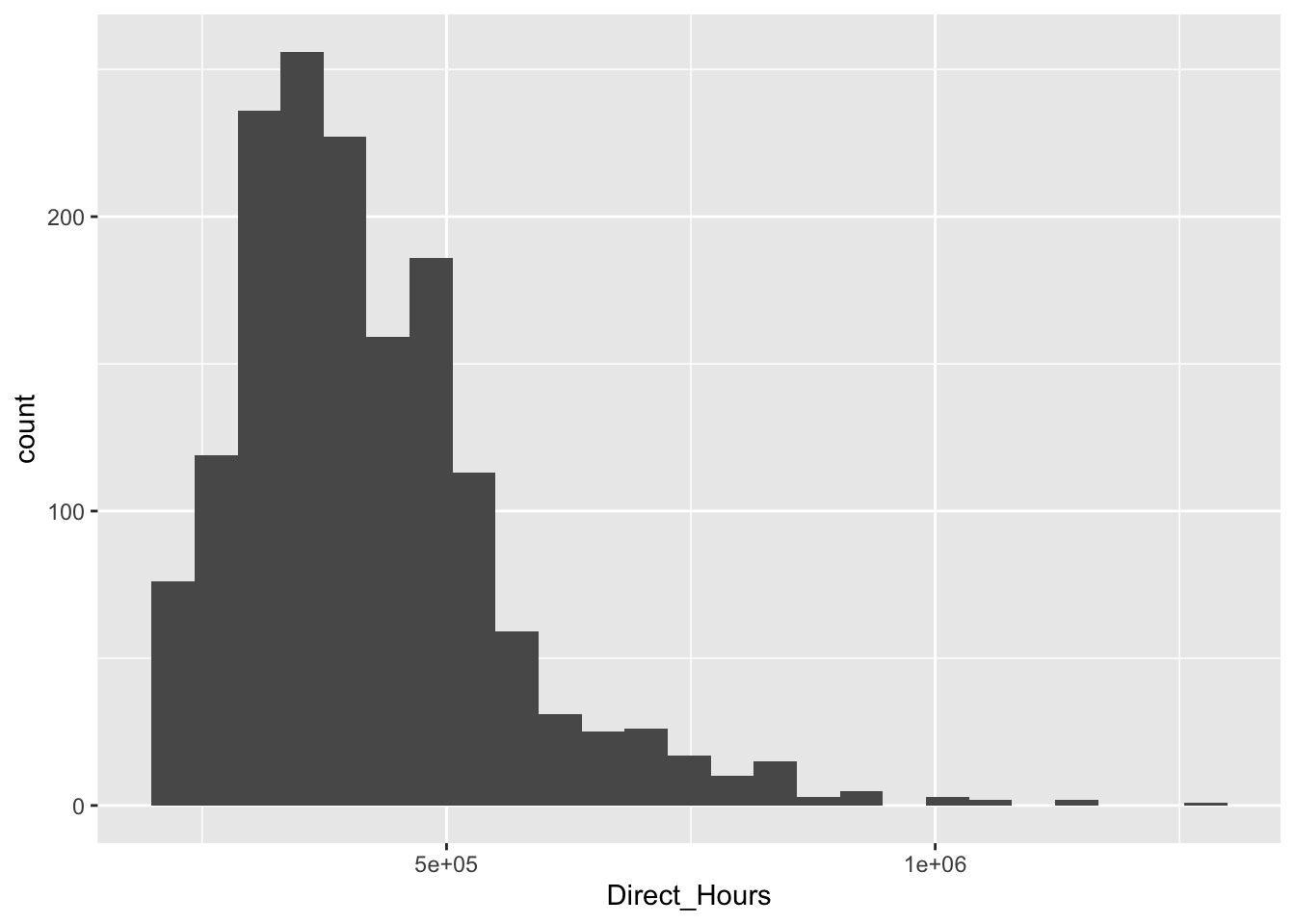
Density
geom_density(): Shows a smoothed estimate of the variable’s distribution.
ggplot(liberty_ship_data, aes(x = Direct_Hours)) +
  geom_density()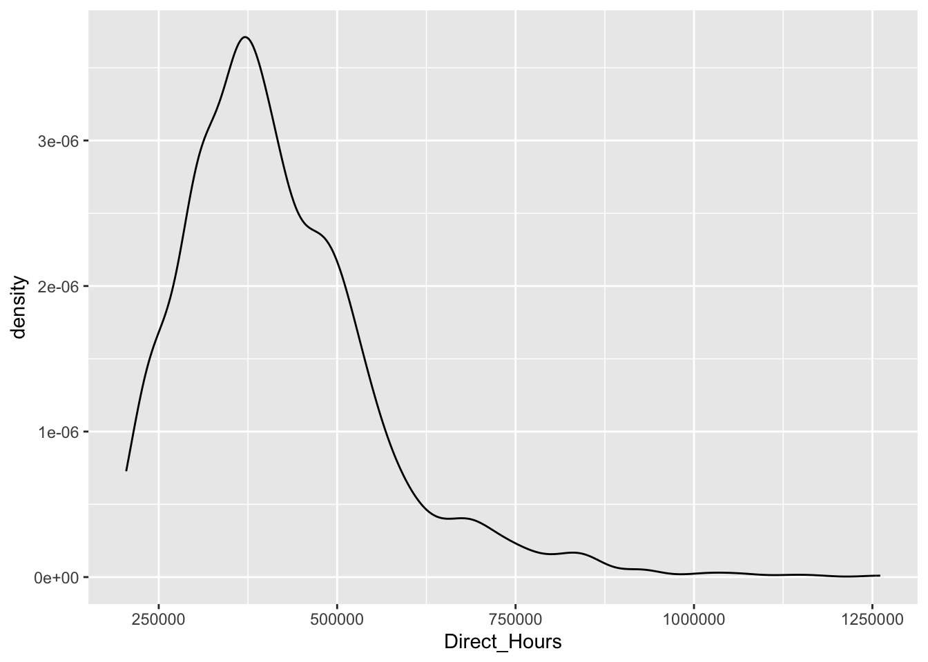
Bar
geom_bar(): Displays counts of categorical data.
ggplot(liberty_ship_data, aes(x = Yard)) +
  geom_bar()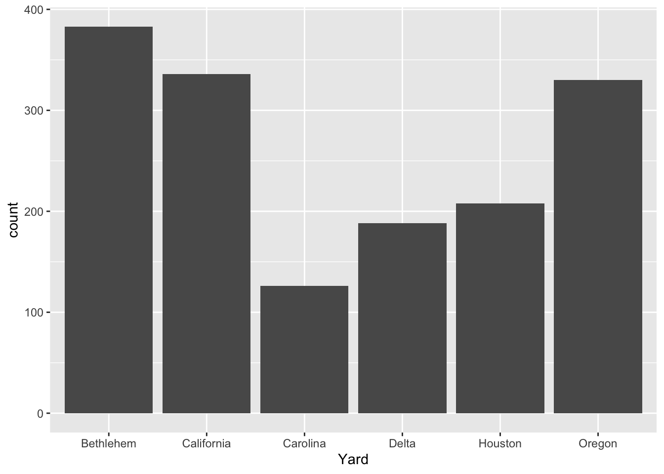
Bivariate Geoms
Used to explore relationships between two variables.
Point
geom_point(): Creates a scatter plot for visualizing relationships between two continuous variables.
ggplot(liberty_ship_data, aes(x = Direct_Hours, y = Total_Production_Days)) +
  geom_point()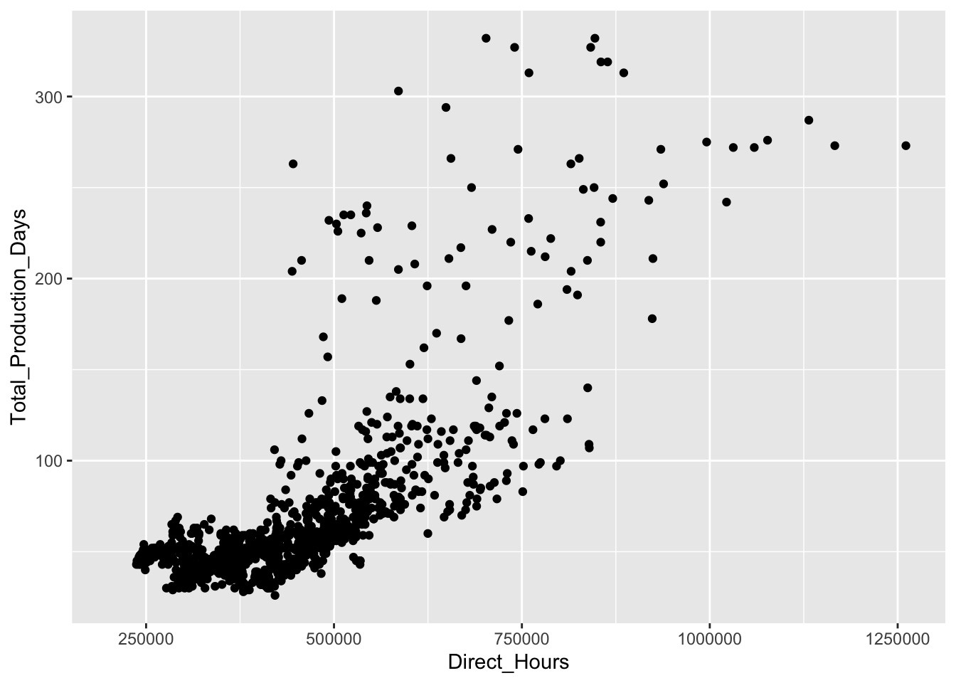
Line
geom_line(): Connects data points with lines, often used for time series or trends.
ggplot(liberty_ship_data, aes(x = Direct_Hours, y = Total_Production_Days)) +
  geom_line()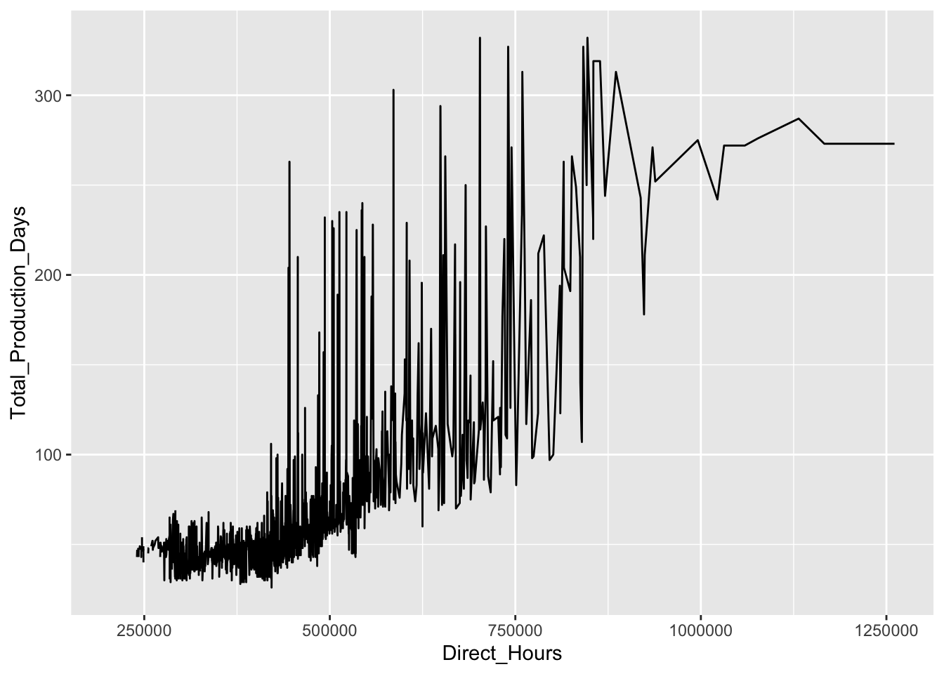
Smooth
geom_smooth(): Adds a smoothed trend line to show overall patterns.
ggplot(liberty_ship_data, aes(x = Direct_Hours, y = Total_Production_Days)) +
  geom_point() +
  geom_smooth(method = "lm")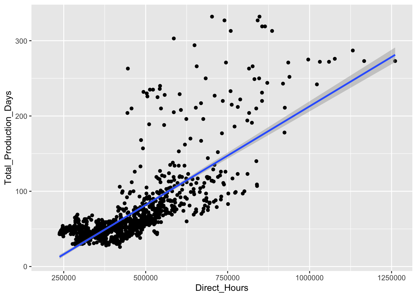
Boxplot
geom_boxplot(): Summarizes the distribution of a continuous variable by categories.
ggplot(liberty_ship_data, aes(x = Yard, y = Total_Production_Days)) +
  geom_boxplot()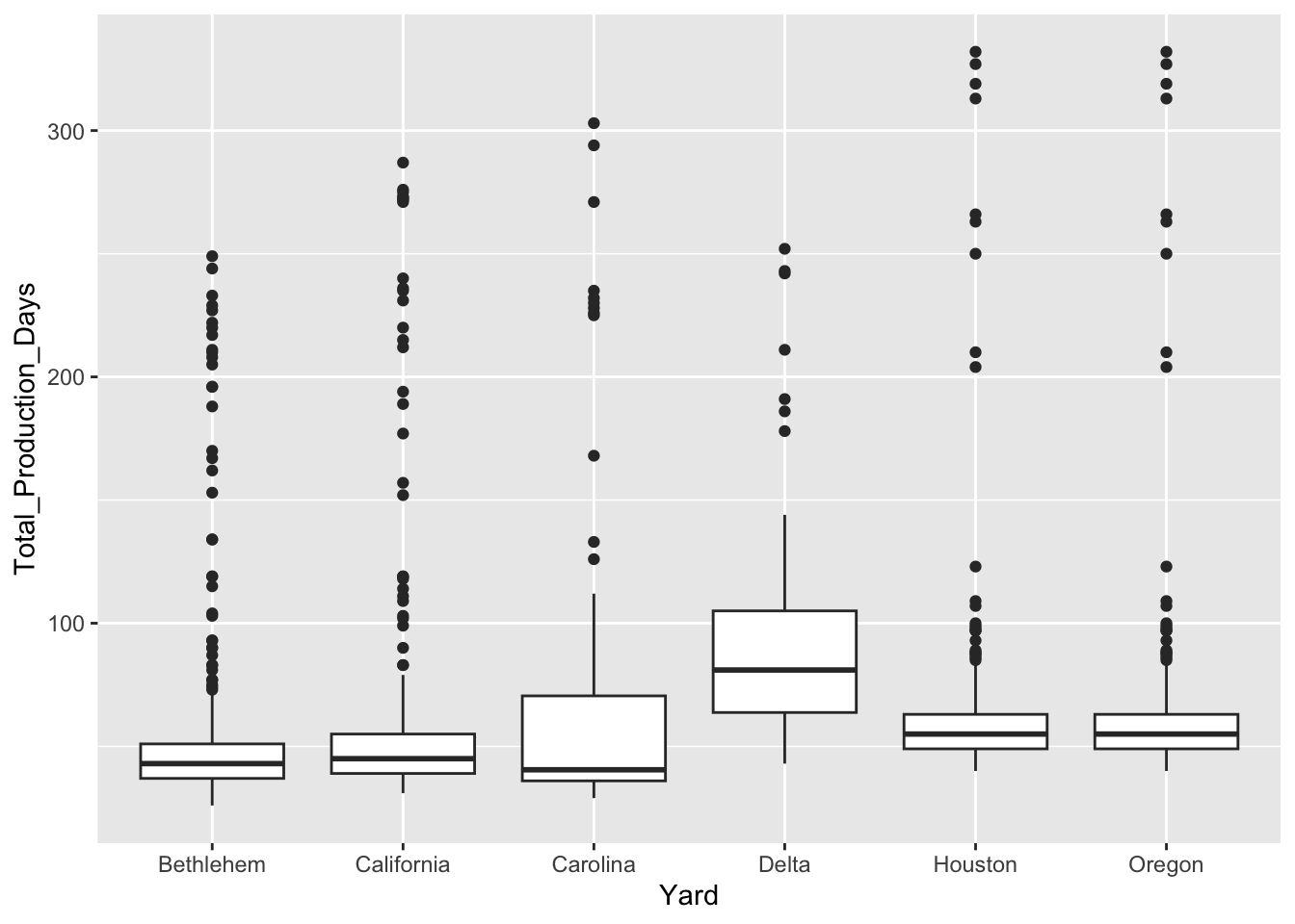
Multivariate Geoms
Used to visualize relationships between more than two variables.
Tile
geom_tile(): Creates a heatmap to display patterns in tabular data.
ggplot(liberty_ship_data, aes(x = Yard, y = Way, fill = Total_Production_Days)) +
  geom_tile()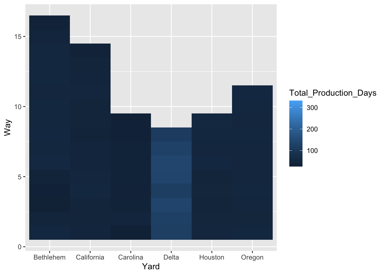
Violin
geom_violin(): Combines boxplots and density plots for grouped data.
ggplot(liberty_ship_data, aes(x = Yard, y = Total_Production_Days)) +
  geom_violin()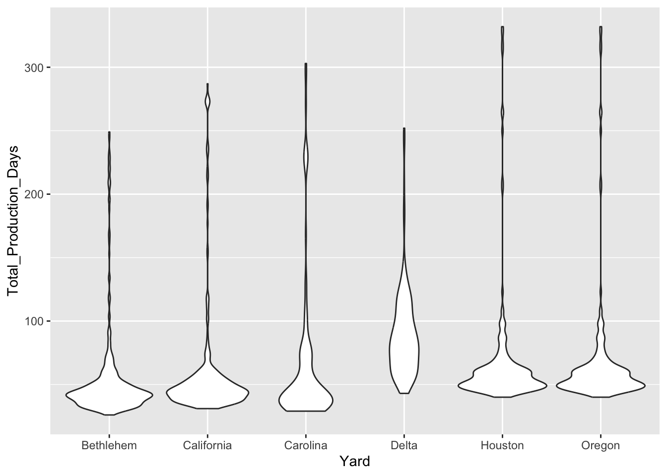
Geoms for Special Cases
Used for more specific visualization needs.
Bar (values instead of counts)
geom_bar(stat = "identity"): Displays actual values instead of counts, useful for summarized data.
# calculate aggregate production and cost data by yard
agg_yard_data <- liberty_ship_data %>%
  group_by(Yard) %>%
  summarize(mean_days = mean(Total_Production_Days, na.rm = T),
            sd_days = sd(Total_Production_Days, na.rm = T),
            mean_cost = mean(Total_Cost, na.rm = T),
            sd_cost = sd(Total_Cost, na.rm = T)
            )

ggplot(agg_yard_data, aes(x = Yard, y = mean_days)) +
  geom_bar(stat = "identity")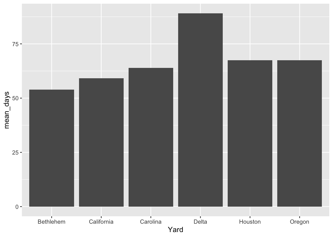
Errorbar
geom_errorbar(): Adds error bars to plots to represent uncertainty.
ggplot(agg_yard_data, aes(x = Yard, y = mean_days,
                          ymin = mean_days - sd_days, ymax = mean_days + sd_days)) +
  geom_bar(stat = "identity") +
geom_errorbar() 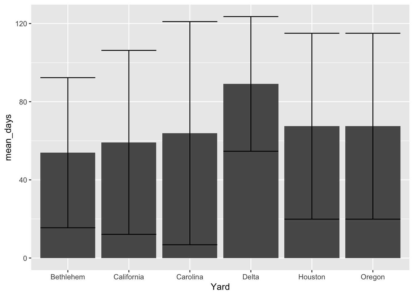
Choosing the Right Geometry
- Univariate Analysis:
- Use
geom_histogram()orgeom_density()for continuous variables. - Use
geom_bar()for categorical variables.
- Use
- Bivariate Analysis:
- Use
geom_point()for scatter plots. - Use
geom_boxplot()orgeom_violin()for comparing distributions across groups.
- Use
- Multivariate or Specialized Needs:
- Use
geom_tile()for heatmaps. - Add
geom_errorbar()to highlight uncertainty.
- Use
18.6 Add Additional Aesthetic Mappings
In addition to mapping data to the x and y variables, we can map other aesthetic properties such as color, shape, size, and linewidth to variables in our dataset. This is useful for adding more dimensions to your plot.
- Color: We can use color to differentiate between categories in the data.
- Shape: Shape can be used to differentiate categories in scatter plots.
- Size: Size can represent a numeric variable, making points larger or smaller based on values.
- Linewidth: If you are drawing lines, you can use linewidth to control the thickness of the lines.
Color
Here’s how to map the variable Yard to color to show how different shipyards affect the relationship between production time and labor hours:
ggplot(liberty_ship_data,
       aes(x = Direct_Hours, y = Total_Production_Days, color = Yard)) +
  geom_point()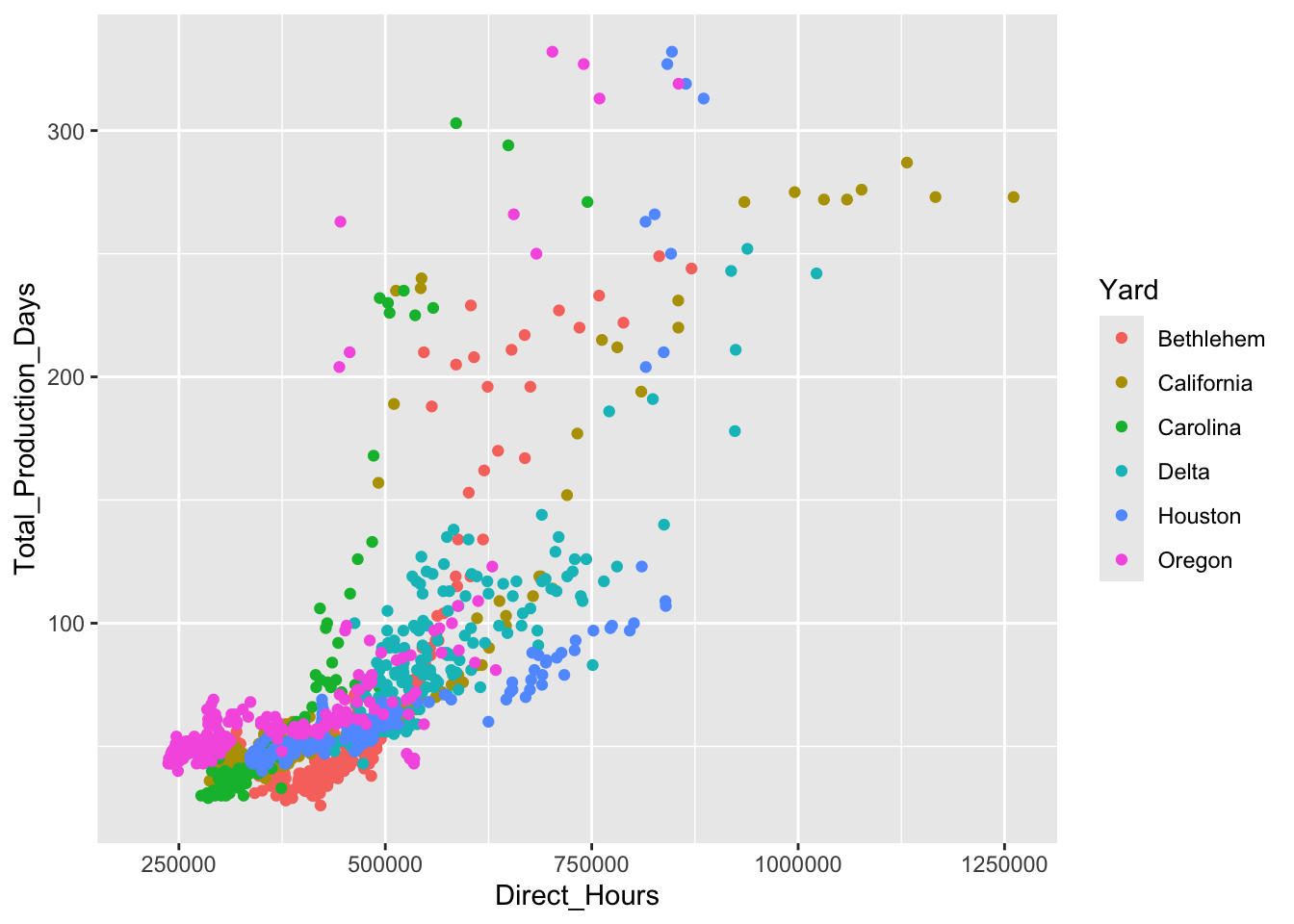
In this case, color differentiates the shipyards, and each point will be colored according to which shipyard built that ship. This helps to visually distinguish groups within the data.
Size
We can also add other aesthetic mappings, such as size, to show the relationship between additional variables:
ggplot(liberty_ship_data,
       aes(x = Direct_Hours, y = Total_Production_Days, color = Yard, size = Total_Cost)) +
  geom_point()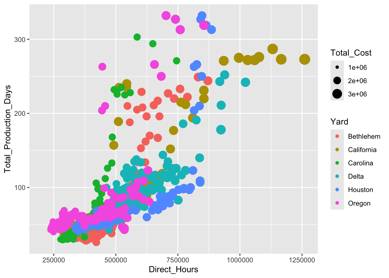
Here, the size of each point corresponds to the total cost to produce each ship, providing additional insight into how labor hours relate to production time and cost.
Exercise: Add Color Aesthetics to the Geometry
Try it yourself
Now map the variable Gym_member to color to show how gym membership affects the relationship between willingness to pay WTP and consumption Quantity.
Hint 1
Re-build your plot from layers beginning with specifying the dataset, then specifying aesthetic mapping of the x- and y-variables as well as the aesthetic mapping of gym membership to color. Then declare the geometry to plot the data points.
Hint 2
Inside the ggplot function, add the argument that the dataset is muscle_cola_data and the aesthetic mapping aes() the specifies that willingness to pay WTP is the x variable and Quantity is the y variable. Add an argument inside the aesthetic mapping that maps color to Gym_member. Then call the geom_point() function to plot the data as points (scatter plot).
aes(x = WTP, y = Quantity, color = Gym_member)Fully worked solution:
As arguments to the ggplot() function, declare the data as muscle_cola_data and the aesthetic mapping as aes(x = WTP, y = Quantity, color = Gym_member). Then call the geom_point() function to plot the data as points.
- 1
-
Call the
ggplot()function and specifymuscle_cola_dataas the data - 2
-
Specify that aesthetic mapping with
WTPplotted on the x-axis andQuantityon the y-axis, adding the mapping of color toGym_member - 3
-
Call the
geom_point()function to get a scatter plot of points
Plot-Level Aesthetics vs. Geom-Specific Aesthetics
When working with ggplot2, you can apply aesthetic mappings at two levels. In some cases, you may want to apply aesthetic mappings only to a specific geom_*(). Aesthetic mappings can be defined within an individual layer (geom_*()), allowing you to control the appearance of different geoms independently.
The key difference is applying global aesthetic mappings at the plot level or local aesthetics at the level of an individual geom:
- Plot-Level Aesthetics (Global Aesthetics): These are defined in the main
ggplot()function and apply to the entire plot. All layers (geoms) in the plot inherit these aesthetics unless specifically overridden. Think of plot-level aesthetics as setting the “default rules” for how variables should be represented.
ggplot(liberty_ship_data, aes(x = Direct_Hours, y = Total_Production_Days, color = Yard)) +
  geom_point() +
  geom_line()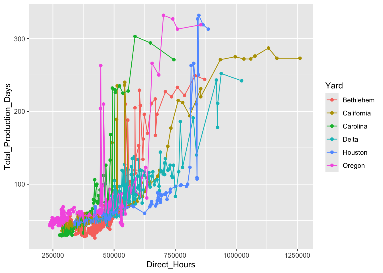
Yard) because the color aesthetic is defined globally.- Geom-Specific Aesthetics (Local Aesthetics): These are defined directly inside individual
geom_*()functions. They apply only to that specific layer and can override the plot-level aesthetics. Use geom-specific aesthetics when you want different layers to have distinct visual properties.
ggplot(liberty_ship_data, aes(x = Direct_Hours, y = Total_Production_Days)) +
  geom_point(aes(color = Yard)) +       # Points use color mapping
  geom_line(aes(linetype = Yard))      # Lines use linetype mapping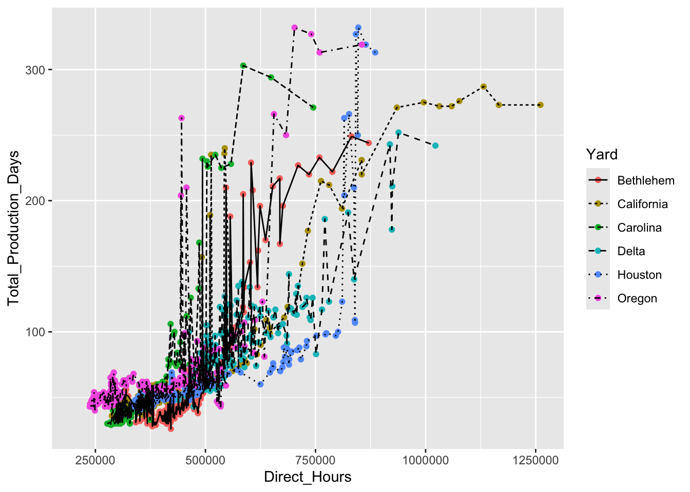
Yard but the lines are not not because the new aesthetic for linetype that was defined for the geom_line() overrides the color set in the general plot aesthetic.Key Differences:
- Plot-Level Aesthetics: Apply to all layers by default (simpler, less repetition).
- Geom-Specific Aesthetics: Provide layer-specific control (more flexibility).
When to Use Which:
- Use plot-level aesthetics when most layers share the same mappings.
- Use geom-specific aesthetics when layers need distinct mappings or when you’re experimenting with a single layer.
Summary of Aesthetic Mappings
To summarize, aesthetic mappings allow you to represent variables in your data through different visual properties, such as:
- x and y positions: Mapped using
aes(x = , y = ). - color: Used to visually separate categories.
- shape: Differentiates categories in scatter plots.
- size: Represents numeric variables by adjusting the size of points.
- linewidth: Controls line thickness for line-based
geomslikegeom_line()orgeom_smooth().
Exercise: Mapping Plot-level Aesthetics and Geom-specific Aesthetics
Try it yourself:
- Plot the relationship between willingness to pay
WTPand monthly consumptionQuantity. - Map the variable
Gym_memberto color to show how gym membership affects the relationship between willingness to payWTPand consumptionQuantity. - Map the length of the respondent’s workout
Workout_lengthto the shape and size of the point to clarify how workout length affects the relationship.
Hint 1
Re-build your plot from layers beginning with specifying the dataset, then specifying aesthetic mapping of the x- and y-variables as well as the aesthetic mapping of gym membership to color. Inside a new aesthetic mapping in the point geometry, map the shape and size of the point to the length of the workout. Then declare the geometry to plot the data points.
Hint 2
Inside the ggplot function, add the argument that the dataset is muscle_cola_data and the aesthetic mapping aes() the specifies that willingness to pay WTP is the x variable and Quantity is the y variable. Add an argument inside the aesthetic mapping that maps color to Gym_member. Then call the geom_point() function to plot the data as points (scatter plot). Add an aesthetic mapping of shape to Workout_length and another of size to Workout_length inside the geom_point().
geom_point(aes(shape = Gym_member))Fully worked solution:
As arguments to the ggplot() function, declare the data as muscle_cola_data and the aesthetic mapping as aes(x = WTP, y = Quantity, color = Gym_member). Then call the geom_point() function to plot the data as points.
1ggplot(muscle_cola_data,
2       aes(x = WTP, y = Quantity, color = Gym_member)) +
3 geom_point(aes(shape = Workout_length, size = Workout_length))- 1
-
Call the
ggplot()function and specifymuscle_cola_dataas the data - 2
-
Specify that aesthetic mapping with
WTPplotted on the x-axis andQuantityon the y-axis, adding the mapping of color toGym_member - 3
-
Call the
geom_point()function to get a scatter plot of points and add the aesthetic that mapsshapeandsizeto theWorkout_length
18.7 Summary
The grammar of graphics provides a structured, layer-by-layer approach to creating visualizations in ggplot2. By understanding its core components, you can construct clear, insightful plots tailored to your data and your audience.
Leverage the grammar of graphics by building the following layers:
- Data: Every plot starts with a dataset. You must define it in the
ggplot()function to begin building visualizations. - Aesthetic Mappings (aes()): Aesthetics define how variables in your dataset are visually represented (e.g., x-axis, y-axis, color, size). These can be applied globally or to specific
geom_*()layers. - Geometric Objects (
geom_*()): Geoms determine the shape of your data’s representation (e.g., points, lines, bars). Choosing the right geom depends on the type of data and the relationships you want to explore. - Additional Aesthetics: Variables can be mapped to properties like
color,size, andshapeto add extra dimensions of information, but use them judiciously to avoid clutter.
The grammar of graphics is more than just a tool—it’s a framework that empowers you to communicate insights effectively. By understanding and applying these principles, you can transform raw data into compelling visual narratives that inform decision-making.
In the next chapters, we’ll explore advanced techniques for refining and enhancing your plots, including labels, scales, facets, and themes, to ensure your visualizations are as impactful as possible.