# A tibble: 60 × 3
   Year  Month Sales
   <fct> <fct> <dbl>
 1 2018  Jan   113.
 2 2019  Jan   123.
 3 2020  Jan    83.2
 4 2021  Jan   126.
 5 2022  Jan   113.
 6 2018  Feb    93.7
 7 2019  Feb    87.9
 8 2020  Feb    41.9
 9 2021  Feb    77.5
10 2022  Feb    71.1
# ℹ 50 more rows17 Principles of Data Visualization
“This is my favorite part about analytics: Taking boring flat data and bringing it to life through visualization.”— John Tukey
17.1 Introduction
Visualization is a powerful tools for entrepreneurs to reduce uncertainty as it uncover patterns, relationships, and trends that are difficult to grasp from raw data alone. Good visualization clarifies, communicates, and uncovers insights, while a bad visualization can mislead or obscure important information.
This chapter explores the value of visualization, highlighting its role in decision-making, storytelling, and guarding against deception.
By the end of this chapter, you will:
- Recognize the principles of good visualization and how to balance clarity and aesthetics.
- Understand how visualization reduces uncertainty and reveals patterns in data.
- Learn how to evaluate visualizations critically to avoid being misled.
- See examples of good vs. bad visualizations and learn to spot deceptive techniques.
17.2 Basic Principles of Good Data Visualization
Before diving into coding, let’s discuss some basic principles to keep in mind when creating visualizations:
Clarity
Your visualization should make the data easier to understand, not harder. Always strive for simplicity and clarity by avoiding unnecessary elements (e.g., 3D effects, excessive gridlines). Every component should contribute to conveying the data’s message.
Honesty
Ensure that your visual representation of data is honest and accurate. This includes using appropriate scales, avoiding distortion (e.g., truncated y-axes that exaggerate differences), and choosing the right chart type for your data.
Audience Awareness
Always consider the audience when designing a visualization. What message are you trying to communicate, and who will be interpreting it? Tailor your visualization to the needs and experience level of your audience.
Minimize Cognitive Load
The visualization should be intuitive and easy to read. Minimize the amount of mental effort your audience needs to interpret the graphic. Use familiar chart types and avoid clutter.
Consistency
Maintain consistent use of colors, scales, and labels. Consistency across visualizations helps the audience compare different aspects of the data and improves the overall readability of your report or presentation.
Data-Ink Ratio
This principle, popularized by Edward Tufte, suggests that the proportion of “data ink” (the ink used to represent the actual data) to non-data ink (decorations, gridlines, etc.) should be maximized. In other words, reduce chart junk and highlight the data.
17.3 The Power of Visualization
Visualization reduces uncertainty by enabling a more holistic view of the data. Unlike numerical summaries, which often focus on expected values, visualizations reveal unexpected patterns, outliers, and trends. They help entrepreneurs:
- Identify opportunities and risks in their data.
- Communicate insights to stakeholders in compelling ways.
- Make informed decisions based on visual evidence.
The dataset sales_datacontains monthly sales data from 2018 through 2022 from a high-end fitness equipment company whose primary customers are gyms. The visualizations below illustrate how the same data can be used to discover and inform or obfuscate:
Heatmap
A heatmap uses color-coded tiles to represent the relationship between two attributes in a dataset. Each tile corresponds to a combination of values, with its color indicating the magnitude or intensity of the relationship.
Why Use a Heatmap?
- Pattern Discovery: Quickly identify trends, clusters, or outliers in the data.
- High-Level Overview: Provides a clear summary of relationships without focusing on precise values.
- Ease of Comparison: Simplifies comparisons across categories or time periods.
Strengths:
- Great for exploring large datasets.
- Highlights patterns that may not be obvious in raw tables or other visualizations.
- Color gradients make anomalies, outliers, and trends immediately visible.
Limitations:
- Less precise; more suited for an overview than detailed analysis.
- Relies heavily on an effective color scale for clarity.
Use heatmaps when you want to summarize and explore complex data, such as spotting seasonal trends or performance variations. In the case of our sales data, use a heatmap to quickly identify months or years with exceptional or poor performance:
Code
ggplot(sales_data, aes(x = Month, y = Year, fill = Sales)) +
  geom_tile() +
  scale_fill_gradient(low = "white", high = "#EB5406") +
  labs(title = "Monthly Sales Heatmap", x = "Month", y = "Year") +
  theme_minimal() +
  theme(axis.text.x = element_text(angle = 45, hjust = 1))  # Rotate x-axis labels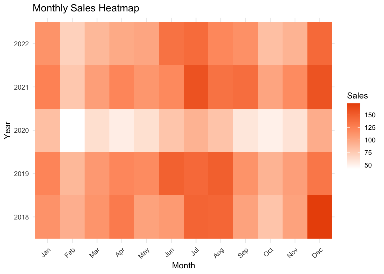
The heatmap reveals several notable insights about the sales data:
Seasonality: Sales are strongest in December and January, as well as in July and August, while much weaker in February and October. This pattern reflects expected seasonality, with peaks driven by the holiday season and New Year’s resolutions. Off-season months in the spring and fall show noticeable drops in sales. These seasonal trends are crucial for anticipating product inventory needs—allowing you to prepare for peak seasons and avoid excess stock during slower periods.
Yearly Trends: Across years, sales steadily grew through 2018 and 2019, reflecting consistent market expansion. However, sales dropped sharply in early 2020, coinciding with the COVID-19 pandemic and the closure of gyms. Sales began to recover in 2021, though signs of inflation and higher interest rates appear to have dampened growth in 2022.
Together, these trends highlight the importance of tracking both seasonality and broader economic factors when planning production, marketing, and inventory strategies.
Line Plot
A line plot displays data points connected by lines to show trends over time or across ordered categories. Each line represents a series of values for a specific category, making it easy to compare trends across multiple categories, such as different years.
Why Use a Line Plot?
- Trend Visualization: Ideal for showing how values change over time or categories.
- Comparing Multiple Series: Makes it easy to compare trends across categories (e.g., sales over multiple years).
- Clear and Continuous: The lines emphasize the flow of data, revealing patterns like growth or decline.
Strengths:
- Best for visualizing trends and changes over time.
- Allows clear comparison of multiple groups (e.g., one line per year).
Limitations:
- May not be as effective for data without a clear order or continuous relationship.
- Can become cluttered if too many series are included.
Use line plots when you want to highlight trends, fluctuations, or comparisons across a set of ordered categories, such as year-over-year performance. In the case of our sales data for fitness equipment, how do the sales patterns evolve over time?
Code
ggplot(sales_data, aes(x = Month, y = Sales, group = Year, color = Year)) +
  geom_line(linewidth = 1.5) +
  geom_point(size = 2) +
  labs(title = "Monthly Sales Trends by Year", x = "Month", y = "Sales (Units)") +
  theme_minimal() +
  theme(axis.text.x = element_text(angle = 45, hjust = 1))  # Rotate x-axis labels
The line plot highlights key insights about the sales data:
- Seasonality: The strongest trend is the clear seasonality in sales. December–January and June–August consistently show above-average performance, indicating the need for higher inventories, additional sales staff, and enhanced order fulfillment during these peak months. Based on five years of data:
- Mid-summer sales are predictably in the range of 140–160 units.
- December sales average around 140 units, with potential spikes to 175 units or more in exceptional years.
- COVID Impact: The COVID year, represented in green, reveals a significant drop in sales compared to other years, reflecting disruptions from gym closures and other pandemic-related challenges. With sales rebounding in subsequent years, these disruptions appear to be behind us.
By analyzing this seasonality and accounting for external factors like COVID, businesses can refine inventory planning and set realistic performance expectations for the future.
Faceted or Grouped Bar Chart
Faceted and grouped bar charts are powerful tools for comparing data across multiple categories.
- Faceted Bar Chart: Splits data into smaller panels (facets), with each panel showing a subset of the data. This is ideal for comparing groups independently (e.g., monthly sales across years).
- Grouped Bar Chart: Places bars for each category side by side within a single plot, enabling direct comparisons (e.g., monthly sales grouped by year).
Why Use These Charts?
Faceted Charts:
- Highlight trends and patterns within individual groups.
- Reduce visual clutter by separating data into smaller, focused plots.
Grouped Charts:
- Allow quick, direct comparisons between groups in a single chart.
- Showcase differences and similarities across categories.
Strengths:
- Easy to interpret for small-to-medium datasets.
- Enable detailed exploration of group-specific patterns.
Limitations:
- Can become cluttered or hard to read with too many categories.
- Facets may lose context when comparing across groups.
Use faceted or grouped bar charts to balance clarity and detail when comparing groups within your data.
Code
ggplot(sales_data, aes(x = Year, y = Sales, fill = Month)) +
  geom_col() +
  facet_wrap(~Month, ncol = 4) +  # Create a facet for each year, arranged vertically
  labs(title = "Monthly Sales by Year", x = "Month", y = "Sales (Units)") +
  theme_minimal() +
  theme(axis.text.x = element_text(angle = 45, hjust = 1))  # Rotate x-axis labels
The faceted bar chart provides a deeper view into the data by plotting each month in its own panel, allowing us to compare annual trends across months. Two key insights emerge:
- Post-COVID Recovery: Sales mostly rebounded in 2021 after the devastating disruption caused by the COVID pandemic. However, February and March sales in 2021 remain well below pre-COVID levels, exacerbating the usual seasonal slowdown. While more data and analysis are needed to confirm this trend, it raises questions about changes in customer behavior during these months after the pandemic shutdowns.
- Actionable Insight: Focus efforts on understanding what shifted during this seasonal slowdown and explore targeted strategies to boost sales during these months.
- Inflation and Interest Rate Impact: The effect of inflation and rising interest rates becomes evident in 2022, where all months—except the always-strong June—show a decline in sales compared to 2021. While the exact cause cannot be confirmed through this chart alone, we can hypothesize:
- Hypothesis: In 2021, the last round of COVID relief funds likely contributed to higher spending, as many consumers viewed this as “free money.” In early 2022, rapidly rising interest rates and inflation may have dampened consumer spending. This likely led to reduced fitness-related expenditures, which in turn affected gym sales and product demand.
- Actionable Insight: Investigate how inflation and borrowing costs influenced customer priorities and consider adapting marketing or pricing strategies to maintain demand during periods of economic strain.
Bad Example: Obfuscating 3D Plot
The 3D plot of the sales data below scores high on the “cool” factor, incorporating interactive features such as hovering for detailed information, zooming, and rotation for different views. The plot uses bubble size to represent sales levels and color to distinguish years.
Code
library(plotly)

# Create a 3D bar plot
plot_ly(sales_data,
        x = ~Month,
        y = ~Year,
        z = ~Sales,
        color = ~Year,
        type = 'scatter3d',
        mode = 'markers',
        marker = list(size = ~Sales/4, color = ~Year)) %>%
  layout(title = "3D Sales Visualization (Obfuscating Example)",
         scene = list(
           xaxis = list(title = "Month"),
           yaxis = list(title = "Year"),
           zaxis = list(title = "Sales")
         ))
While visually impressive, the unnecessary 3D effects in this visualization introduce more challenges than benefits:
- Distorted Data: The additional dimension makes it harder to interpret patterns compared to simpler, 2D visualizations.
- Occlusion: Data points in the foreground can obscure those behind them, reducing clarity.
- Cognitive Load: Rotating and interacting with the plot adds complexity, which can detract from insights rather than enhance them.
Key Takeaway
While 3D plots can offer unique perspectives and are useful in certain contexts, they often obscure more than they reveal in simpler datasets. The design of visualizations is critical—done well, it increases insight, but poorly designed visuals can lead to confusion.
In Chapter 20, we will explore situations where 3D visualizations are genuinely beneficial, providing tools to maximize clarity and utility.
Perrenial Bad Example: Pie Chart
A pie chart is a circular chart divided into slices, where each slice represents a proportion of a whole. While widely used, pie charts often fail to effectively communicate data for several reasons:
Limitations of Pie Charts:
- Hard to Compare Slices:
- Humans are better at comparing lengths (bars) than angles or areas, making it difficult to judge the relative size of slices accurately.
- For data with many categories or similar proportions, distinctions between slices become nearly impossible to interpret.
- Wasted Space: A significant portion of the chart is empty space within the circle, making it less efficient at displaying data compared to alternatives like bar charts.
- Lack of Clarity: Pie charts struggle to display trends, patterns, or relationships in the data. They’re static and focused solely on proportions without offering additional context.
Why People Use Pie Charts:
- They are familiar and visually appealing.
- They work well for simple data with only 2–3 categories, where proportions are distinct (e.g., “50% vs. 30% vs. 20%”).
Better Alternatives:
“There is no data that can be displayed in a pie chart, that cannot be displayed BETTER in some other type of chart.”— John Tukey
- Bar Charts: These allow precise comparisons of category sizes and are easier to interpret.
- Stacked Bar Charts: Useful for showing proportions while maintaining clarity.
While pie charts may seem intuitive, their design often obscures the very insights they aim to reveal. In most cases, a bar chart or other alternative will better serve your audience by making comparisons and relationships more apparent.
Let’s try to learn something valuable from pie charts of the sales data.
Code
# Basic piechart
p2018 <- ggplot(sales_data %>% filter(Year == 2018), aes(x="", y=Sales, fill=Month)) +
  geom_bar(stat="identity", width=1, color="white") +
  coord_polar("y", start=0) +
  theme_void() + ggtitle("2018 Sales")
p2019 <- ggplot(sales_data %>% filter(Year == 2019), aes(x="", y=Sales, fill=Month)) +
  geom_bar(stat="identity", width=1, color="white") +
  coord_polar("y", start=0) +
  theme_void() + ggtitle("2019 Sales")
p2020 <- ggplot(sales_data %>% filter(Year == 2020), aes(x="", y=Sales, fill=Month)) +
  geom_bar(stat="identity", width=1, color="white") +
  coord_polar("y", start=0) +
  theme_void() + ggtitle("2020 Sales")
p2021 <- ggplot(sales_data %>% filter(Year == 2021), aes(x="", y=Sales, fill=Month)) +
  geom_bar(stat="identity", width=1, color="white") +
  coord_polar("y", start=0) +
  theme_void() + ggtitle("2021 Sales")
p2022 <- ggplot(sales_data %>% filter(Year == 2022), aes(x="", y=Sales, fill=Month)) +
  geom_bar(stat="identity", width=1, color="white") +
  coord_polar("y", start=0) +
  theme_void() + ggtitle("2022 Sales")

#############

p2020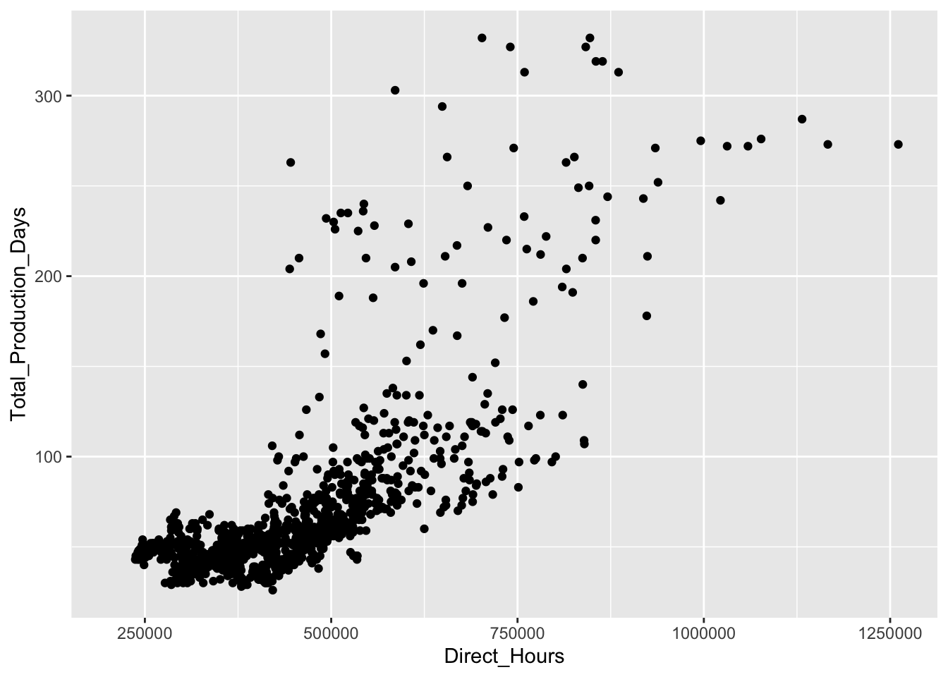
Code
ggplot(sales_data, aes(x="", y=Sales, fill=Month)) +
  geom_bar(stat="identity", width=1, color="white") +
  coord_polar("y", start=0) +
  facet_wrap(~Year, ncol = 3) +  # Create a facet for each year, arranged vertically
  theme_void()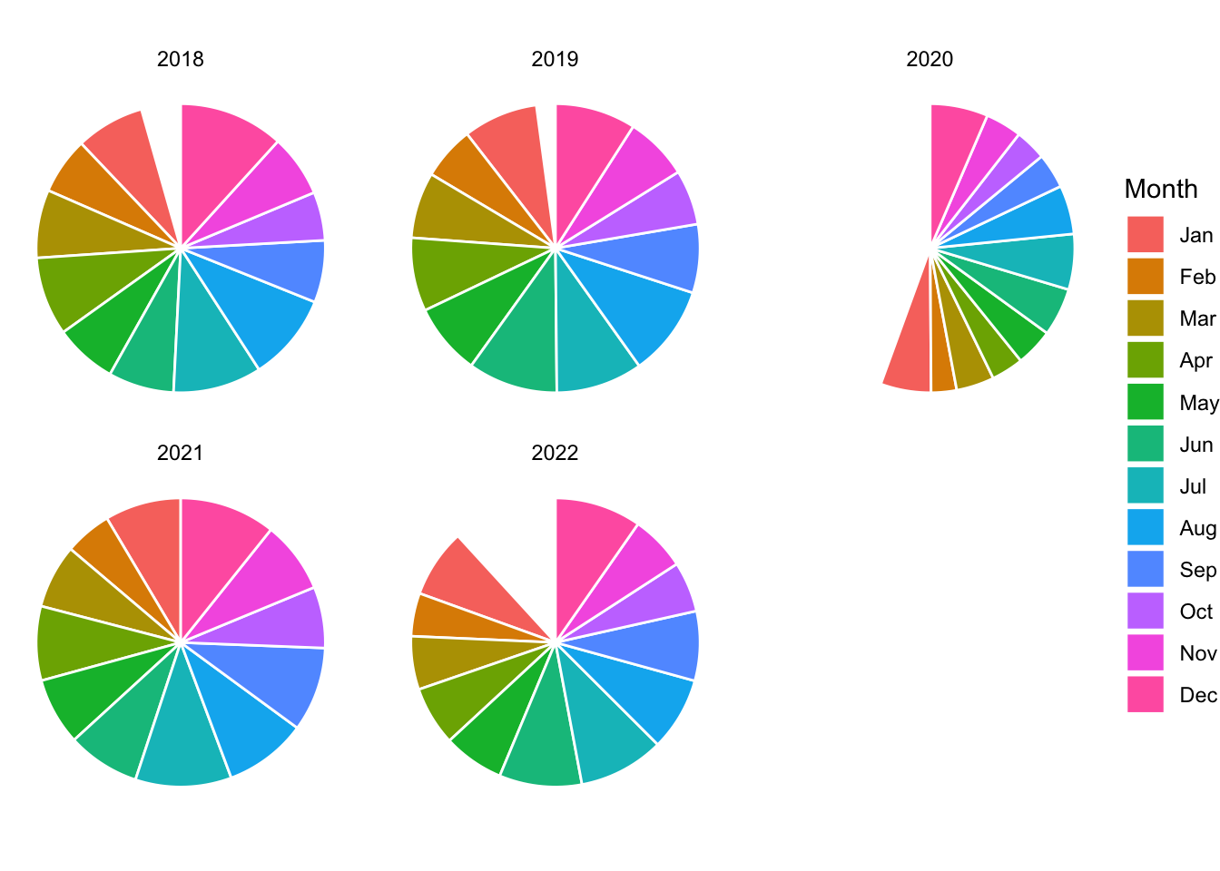
Code
ggplot(sales_data, aes(x="", y=Sales, fill=Month)) +
  geom_bar(stat="identity", width=1, color="white") +
  coord_polar("y", start=0) +
  theme_void()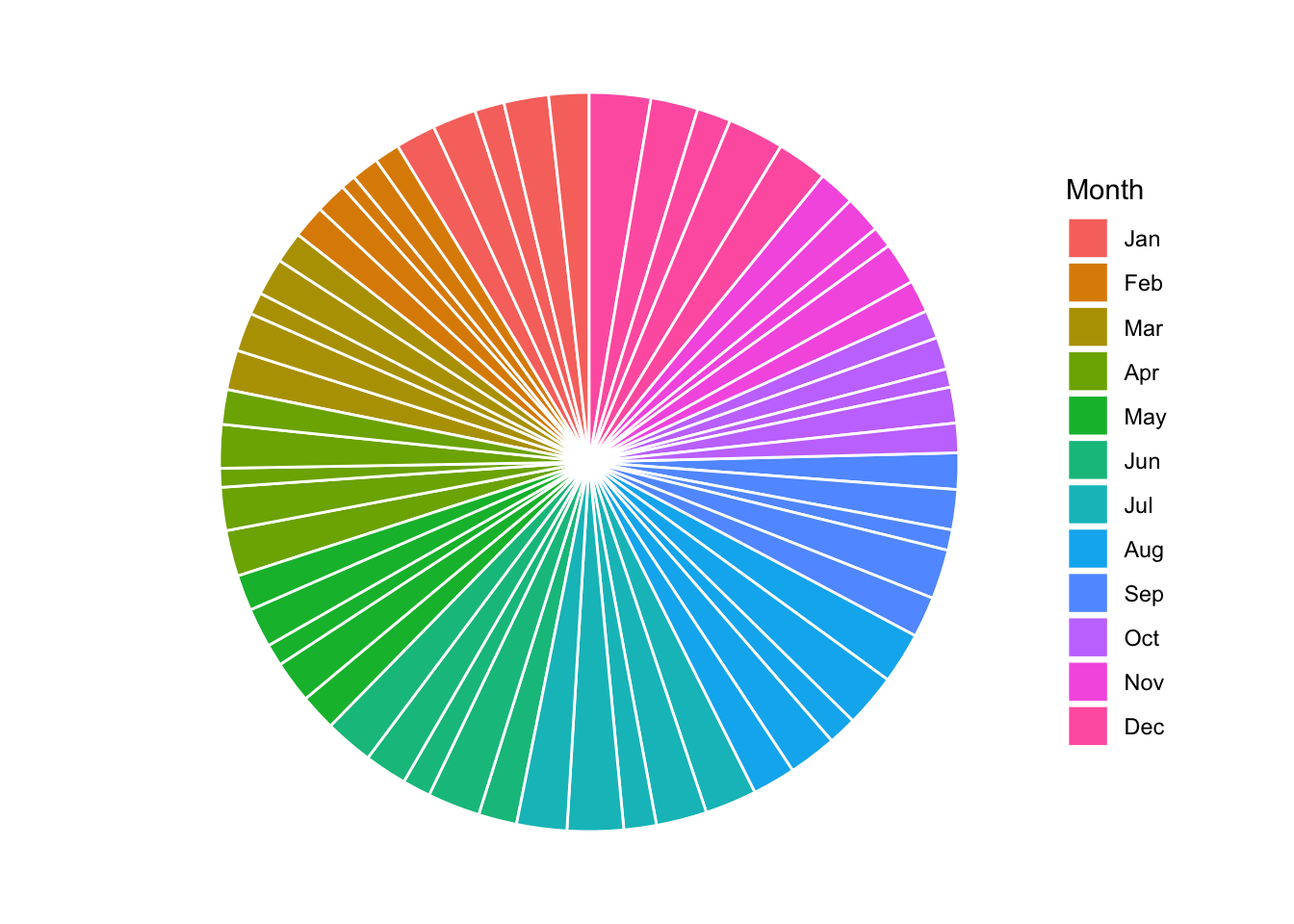
Across several different attempts, pie charts give very little insight into the patterns and trends in this sales data.
17.4 Recognizing Deceptive Visualizations
Not all visualizations are created with clarity in mind. Some intentionally or unintentionally mislead by:
- Truncating axes to exaggerate differences.
- Using inappropriate chart types.
- Overloading with unnecessary decoration (chartjunk).
Example: Truncated Axes
Good Example: Honest Axes
Code
ggplot(sales_data, aes(x = Month, y = Sales/5)) +
  geom_col(fill = "seagreen") +
  labs(title = "Honest Sales Visualization", x = "Month", y = "Sales (Units)") +
  theme_minimal()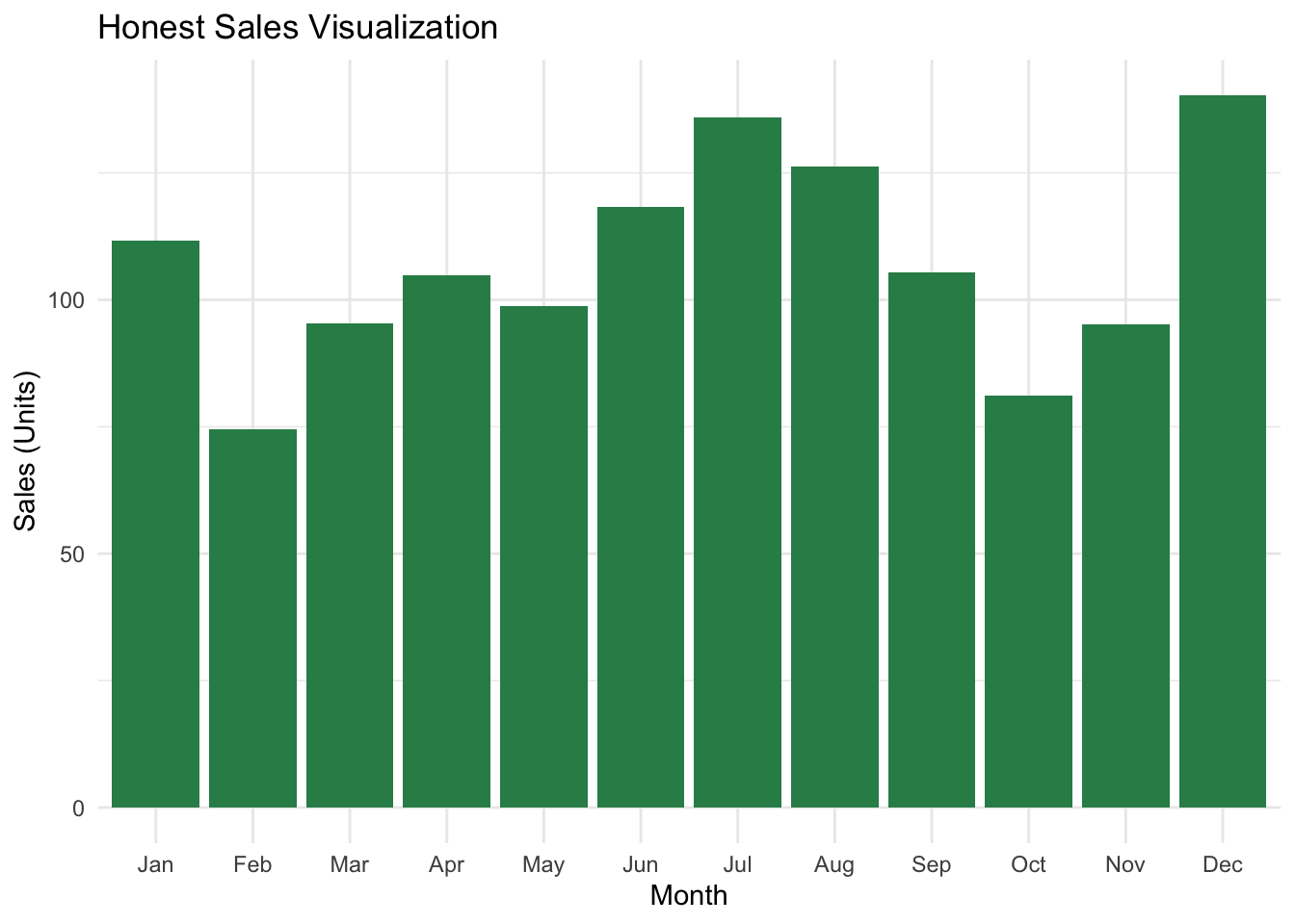
Bad Example: Truncated Y-Axis
This version artificially exaggerates differences by starting the y-axis at 100.
Code
ggplot(sales_data, aes(x = Month, y = Sales/5)) +
  geom_col(fill = "red") +
  labs(title = "Manipulated Sales Visualization", x = "Month", y = "Sales (Units)") +
  theme_minimal() +
  coord_cartesian(ylim = c(100, max(sales_data$Sales)))
17.5 Summary
Visualizations serve as powerful decision-making tools for entrepreneurs, enabling them to:
- Spot opportunities by identifying outliers or trends.
- Communicate ideas to stakeholders visually.
- Protect themselves against misleading data presentations.
Visualization bridges the gap between raw data and actionable insights. By following principles of clarity, simplicity, and honesty, entrepreneurs can create visualizations that reduce uncertainty, reveal patterns, and drive better decisions.
In the next chapter, we will dive into the Grammar of Graphics, learning how to create powerful visualizations step-by-step using ggplot2() from the tidyverse collection of libraries.