25 Testing for Normality
25.1 Introduction
Normality is a cornerstone assumption in many statistical methods. Knowing whether your data follows a normal distribution helps guide the choice of analytical techniques, from descriptive summaries to advanced modeling. Testing for normality ensures that statistical assumptions are met or highlights when adjustments, such as transformations or non-parametric methods, are necessary.
In this chapter, we’ll explore:
- The properties of a normal distribution.
- Why normality matters for statistical analysis.
- How to assess normality visually and statistically.
- Practical guidance on interpreting results and choosing appropriate methods.
25.2 What Is a Normal Distribution?
The normal distribution, or “bell curve,” is a probability distribution commonly used in statistics. Its symmetrical shape and predictable properties make it an ideal benchmark for many analyses.
Key Properties
- Symmetry: The distribution is perfectly symmetric around the mean.
- Mean, Median, and Mode Alignment: All three measures of central tendency coincide at the center.
- Standard Deviations: As we saw in Figure 24.1, approximately:
- 68% of data falls within 1 standard deviation of the mean.
- 95% within 2 standard deviations.
- 99.7% within 3 standard deviations.
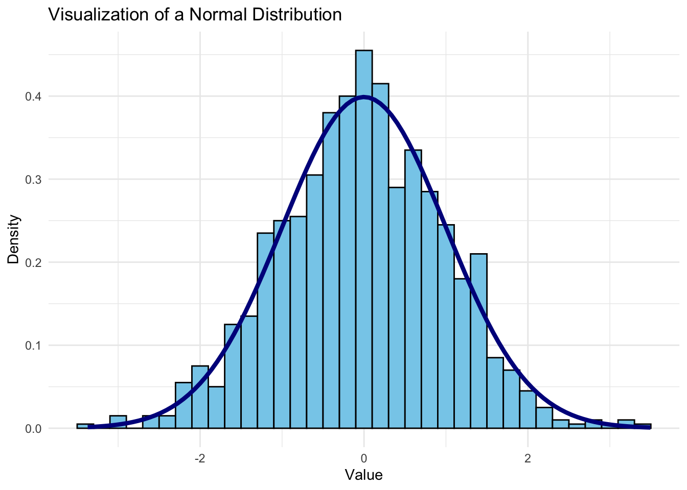
Let’s visualize a normal distribution to see these properties in action.
This plot shows a classic bell-shaped curve, highlighting the central clustering and symmetry of a normal distribution.
25.3 Real-World Contexts for Normal Distributions
Normal distributions are frequently observed in various real-world contexts:
- Human Characteristics: Many biological traits, like height and blood pressure, are approximately normally distributed.
- Measurement Errors: In scientific and engineering measurements, errors often follow a normal distribution due to random variations.
- Business and Economics: Some financial metrics, like daily stock returns (under certain conditions), are assumed to be normally distributed for modeling and forecasting.
These contexts rely on the normal distribution to create reliable benchmarks, allowing us to predict outcomes and assess what’s typical or unusual within a dataset.
25.4 Why the Normal Distribution Matters
The normal distribution helps us make sense of what’s typical in our data and identify values that stand out. By using Z-scores, we can quickly assess whether a value is within an expected range or if it’s unusually high or low. This can be invaluable for detecting anomalies, setting benchmarks, and making decisions across various fields.
Takeaway: When a dataset is normally distributed, it’s easier to interpret central tendency and variability. We can confidently use Z-scores to detect outliers and make informed decisions about unusual data points. Understanding the normal distribution’s properties gives us a powerful tool for data analysis and decision-making.
25.5 Testing for Normality with Visualization
Once we understand the concept of a normal distribution, it’s often important to test whether our data approximates this distribution. Many statistical methods assume normality, and knowing whether data meets this assumption can guide our approach to analysis.
Histogram
Plotting the data as a histogram and comparing it visually to a bell curve is a straightforward way to check for normality. If the histogram approximates a symmetric, bell-shaped curve, the data may be normally distributed.
Q-Q Plot (Quantile-Quantile Plot)
A Q-Q plot compares the quantiles of our data to the quantiles of a theoretical normal distribution. If the data is normally distributed, points in a Q-Q plot will approximately follow a straight line.
Code
# Plotting a Q-Q plot
ggplot(normal_data, aes(sample = value)) +
  stat_qq(color = "blue") +
  stat_qq_line(color = "red", linetype = "dashed") +
  labs(title = "Q-Q Plot for Normality Check", x = "Theoretical Quantiles", y = "Sample Quantiles") +
  theme_minimal()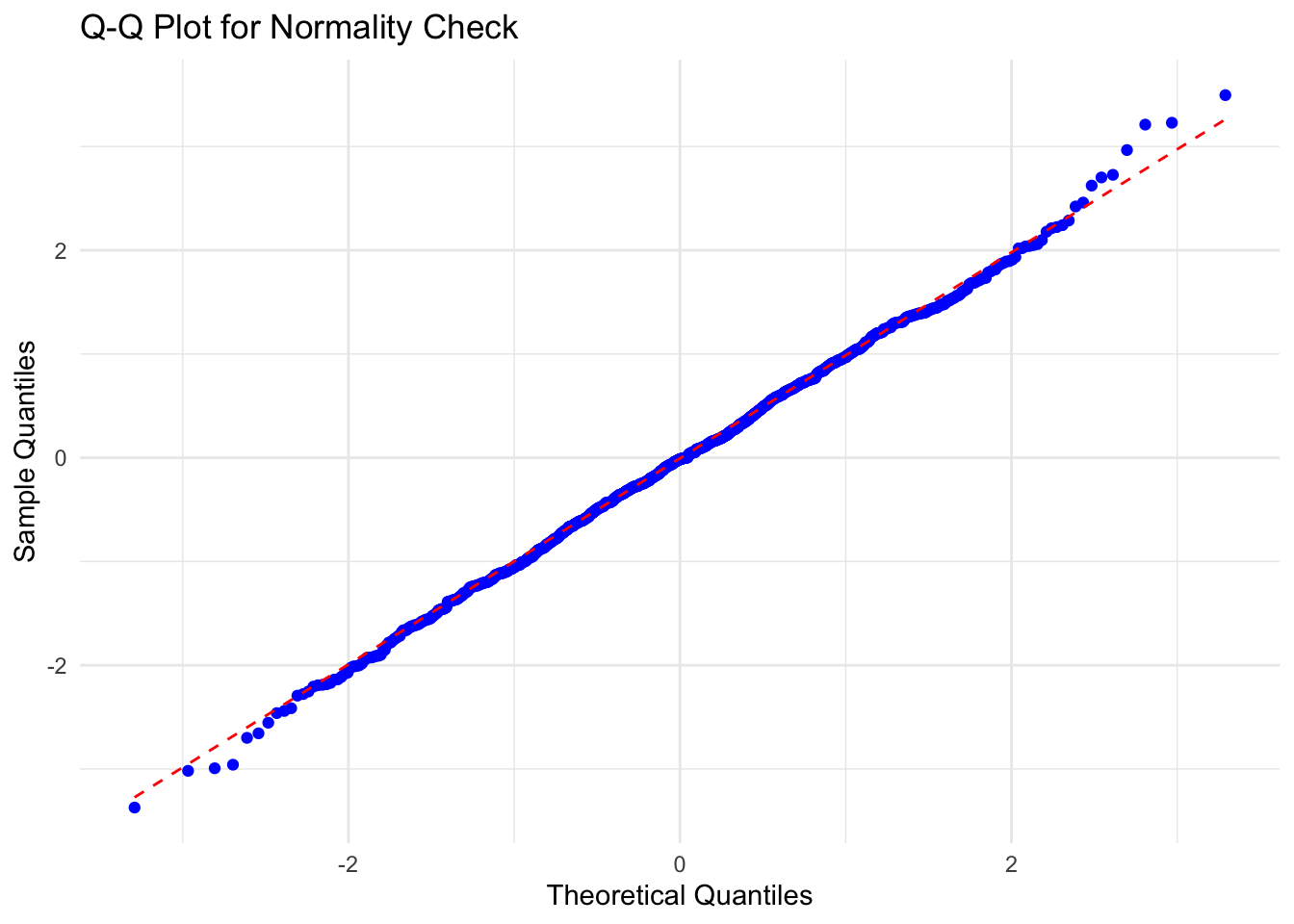
value appears to be normally distributedIn this plot, if the points closely follow the dashed line, the data can be considered approximately normal. Deviations from this line indicate departures from normality.
In this particular plot, the points follow the dashed line closely except at the upper quantile levels where deviation begins. The deviation appears to be small and it is likely that value is normally distributed. To be sure, we can apply a statistical test to quantify our confidence in this conclusion.
25.6 Testing for Normality with Statistics
Shapiro-Wilk Test
The Shapiro-Wilk test is a common statistical test for normality. It produces a p-value that helps us decide whether to reject the null hypothesis (that the data is normally distributed). A small p-value (typically < 0.05) indicates that the data is unlikely to be normally distributed.
Code
# Shapiro-Wilk test for normality
shapiro_test <- shapiro.test(normal_data$value)
shapiro_test
    Shapiro-Wilk normality test

data:  normal_data$value
W = 0.99882, p-value = 0.767
In the output, the test’s p-value tells us whether the data significantly deviates from a normal distribution. A p-value greater than 0.05 suggests that the data may approximate a normal distribution. Since the p-value of 0.7669591 is much greater than 0.05, we have greater confidence that the variable has a normal distribution.
Note: Visual methods provide a general sense of normality, while statistical tests offer more rigor. However, keep in mind that large sample sizes can make tests overly sensitive, rejecting normality for minor deviations.
25.7 Demonstration: Testing Whether Liberty Ship Productivity Variables Are Normally Distributed
Demonstration Data
Let’s use the Liberty ships dataset from Section 18.2 to test the normality of the key variables in the dataset. Specifically, we’ll examine whether the Direct_Hours, Total_Production_Days, and Total_Cost variables follow a normal distribution.
# A tibble: 1,571 × 6
    Unit Yard        Way Direct_Hours Total_Production_Days Total_Cost
   <dbl> <chr>     <dbl>        <dbl>                 <dbl>      <dbl>
 1     1 Bethlehem     1       870870                   244   2615849
 2     2 Bethlehem     2       831745                   249   2545125
 3     3 Bethlehem     3       788406                   222   2466811
 4     4 Bethlehem     4       758934                   233   2414978
 5     5 Bethlehem     5       735197                   220   2390643
 6     6 Bethlehem     6       710342                   227   2345051
 7     8 Bethlehem     8       668785                   217   2254490
 8     9 Bethlehem     9       675662                   196   2139564.
 9    10 Bethlehem    10       652911                   211   2221499.
10    11 Bethlehem    11       603625                   229   2217642.
# ℹ 1,561 more rows
Histogram
Code
# Plotting the normal distribution
library(ggplot2)
direct_hours_plot <- ggplot(liberty_ship_data, aes(x = Direct_Hours)) +
  geom_histogram(aes(y = after_stat(density)), binwidth = 25000, fill = "#238b45", color = "black") +
  stat_function(fun = dnorm, args = list(mean = mean(liberty_ship_data$Direct_Hours),
                                         sd = sd(liberty_ship_data$Direct_Hours)),
                color = "darkblue", linewidth = 1.5) +
  labs(title = "Histogram of Liberty Ship Production", x = "Direct Hours", y = "Density") +
  theme_minimal()
direct_hours_plot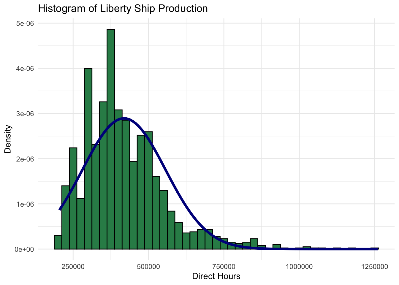
Code
production_days_plot <- ggplot(liberty_ship_data, aes(x = Total_Production_Days)) +
  geom_histogram(aes(y = after_stat(density)), binwidth = 10, fill = "#6a51a3", color = "black") +
  stat_function(fun = dnorm, args = list(mean = mean(liberty_ship_data$Total_Production_Days,na.rm=T),
                                         sd = sd(liberty_ship_data$Total_Production_Days,na.rm=T)),
                color = "darkblue", linewidth = 1.5) +
  labs(title = "Histogram of Liberty Ship Production", x = "Total Production Days", y = "Density") +
  theme_minimal()
production_days_plot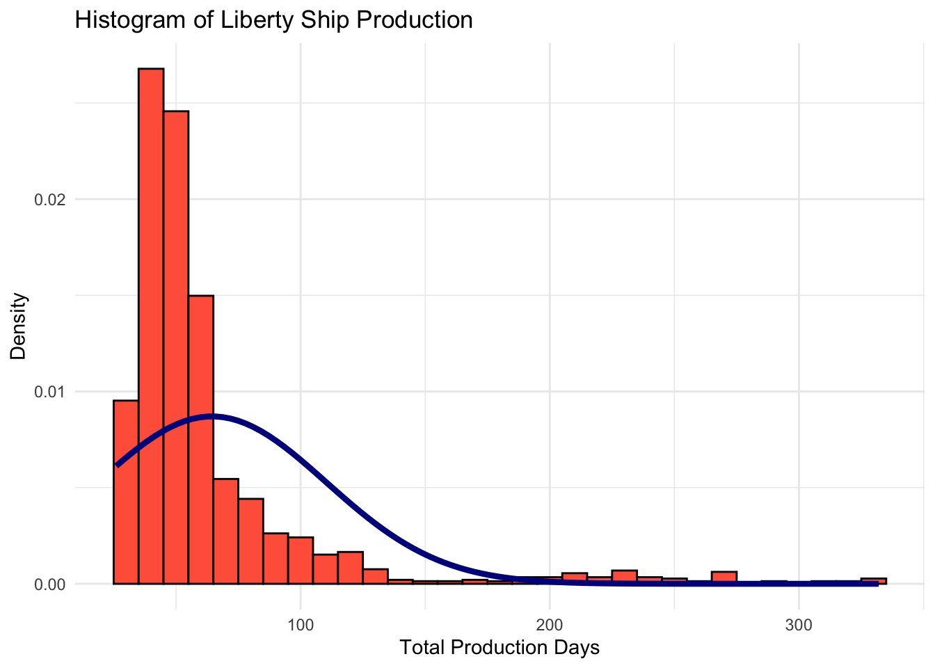
Code
total_cost_plot <- ggplot(liberty_ship_data, aes(x = Total_Cost)) +
  geom_histogram(aes(y = after_stat(density)), binwidth = 100000, fill = "#d94701", color = "black") +
  stat_function(fun = dnorm, args = list(mean = mean(liberty_ship_data$Total_Cost,na.rm=T),
                                         sd = sd(liberty_ship_data$Total_Cost,na.rm=T)),
                color = "darkblue", linewidth = 1.5) +
  labs(title = "Histogram of Liberty Ship Production", x = "Total Cost", y = "Density") +
  theme_minimal()
total_cost_plot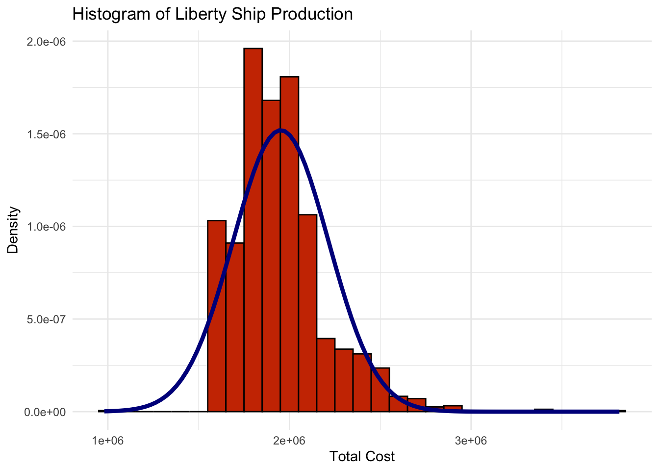
None of these histograms fit closely with the normal distribution with the same mean and standard deviation that is superimposed over the histogram. Histogram visualization casts doubt on whether any of
Direct_Hours,Total_Production_DaysorTotal_Costare normally distributed.
Q-Q Plot Test of Normality
Having seen that the histograms of the three productivity variables of Liberty ship productivity do not appear to be normally distributed, we can generate Q-Q plots to verify. If the quantiles of the data do not follow the quantils of a theoretical normal distribution, we have further evidence that Direct_Hours, Total_Production_Days, and Total_Cost are not normally distributed.
Code
# Plotting a Q-Q plot
ggplot(liberty_ship_data, aes(sample = Direct_Hours)) +
  stat_qq(color = "#238b45") +
  stat_qq_line(color = "darkblue", linetype = "dashed") +
  labs(title = "Q-Q Plot for Direct Labor Hours", x = "Theoretical Quantiles", y = "Sample Quantiles") +
  theme_minimal()
Code
ggplot(liberty_ship_data, aes(sample = Total_Production_Days)) +
  stat_qq(color = "#6a51a3") +
  stat_qq_line(color = "darkblue", linetype = "dashed") +
  labs(title = "Q-Q Plot for Total Production Days", x = "Theoretical Quantiles", y = "Sample Quantiles") +
  theme_minimal()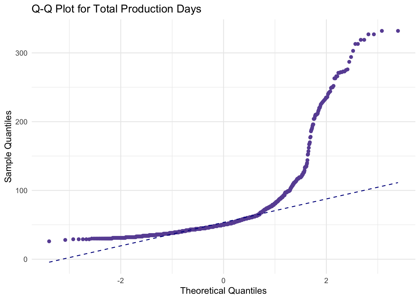
Code
ggplot(liberty_ship_data, aes(sample = Total_Cost)) +
  stat_qq(color = "#d94701") +
  stat_qq_line(color = "darkblue", linetype = "dashed") +
  labs(title = "Q-Q Plot for Total Cost", x = "Theoretical Quantiles", y = "Sample Quantiles") +
  theme_minimal()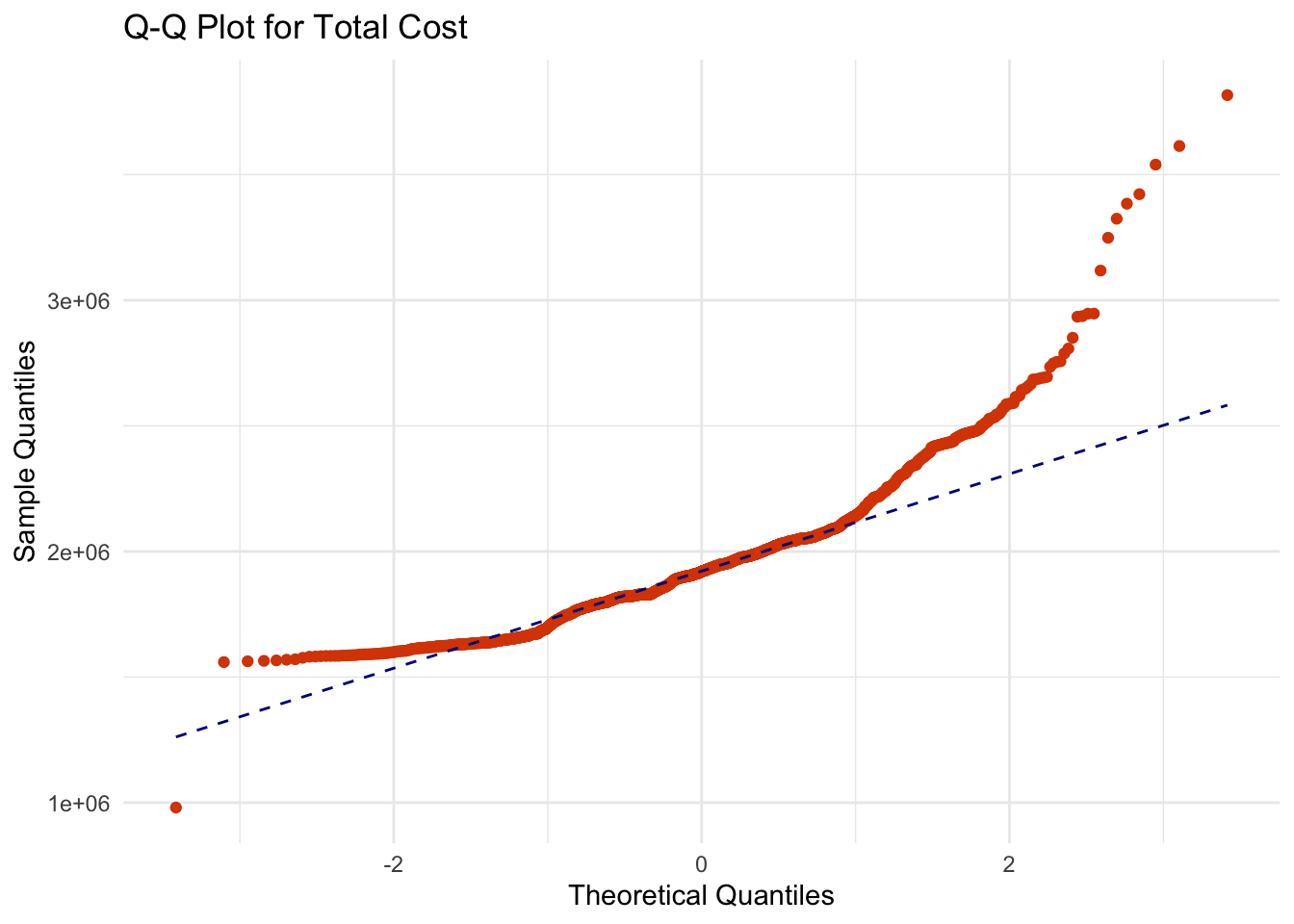
Q-Q plots reaffirm that the Liberty ship productivity variables of
Direct_Hours,Total_Production_DaysorTotal_Costdo not follow the theoretical quantiles of a normal distribution. In other words, they are unlikely to be normally distributed.
Shapiro-Wilk Test
Visualization repeatedly suggests that the chosen Liberty ship productivity variables are not normally distributed. We can confirm with statistical confidence using the Shapiro-Wilk test.
Code
# Shapiro-Wilk test for normality for the Direct_Hours variable
shapiro_direct_hours <- shapiro.test(liberty_ship_data$Direct_Hours)
shapiro_direct_hours
    Shapiro-Wilk normality test

data:  liberty_ship_data$Direct_Hours
W = 0.91011, p-value < 2.2e-16
Code
# Shapiro-Wilk test for normality for the Total_Production_Days variable
shapiro_production_days <- shapiro.test(liberty_ship_data$Total_Production_Days)
shapiro_production_days
    Shapiro-Wilk normality test

data:  liberty_ship_data$Total_Production_Days
W = 0.59773, p-value < 2.2e-16
Code
# Shapiro-Wilk test for normality for the Total_Production_Days variable
shapiro_total_cost <- shapiro.test(liberty_ship_data$Total_Cost)
shapiro_total_cost
    Shapiro-Wilk normality test

data:  liberty_ship_data$Total_Cost
W = 0.89422, p-value < 2.2e-16
The Shapiro-Wilk tests of Direct Labor Hours, Total Production Days, and Total Cost all have p-values that are effectively zero. This means that we can reject the null hypothesis that these variables are normally distributed at the 99% confidence level.
25.8 Exercise: Testing for Normality with Statistics and Visalization
Try it yourself:
Perform the Q-Q plot and Shapiro-Wilk tests to determine whether the age and/or spending variables in UrbanFind’s customer_data are normally distributed. Which test is more appropriate?
Hint 1
- Plot the Q-Q plot for both variables.
- Calculate the Shapiro-Wilk test statistic
Hint 2
- For the Q-Q plot: ggplot(data, aes(sample = variable)) + stat_qq() + stat_qq_line()
ggplot(data, aes(sample = variable)) + stat_qq() + stat_qq_line()- For the Shapiro-Wilk test statistic: shapiro.test(data$variable)
shapiro.test(data$variable)Fully worked solution:
1ggplot(customer_data, aes(sample = age)) +  stat_qq() + stat_qq_line()
2shapiro.test(customer_data$age)
#
3ggplot(customer_data, aes(sample = spending)) +  stat_qq() + stat_qq_line()
4shapiro.test(customer_data$spending)- 1
-
Plot the Q-Q plot for the
agevariable and check for deviations from normal - 2
-
Calculate the Shapiro-Wilks test for the
ageand compare the p-value to 0.05 # - 3
-
Plot the Q-Q plot for the
spendingvariable and check for deviations from normal - 4
-
Calculate the Shapiro-Wilks test for the
spendingand compare the p-value to 0.05
- Which variables may not be normally distributed?
- Which test seems more appropriate to test for normality in these variables?
25.9 When to Test for Normality
Testing for normality is particularly relevant when:
- We plan to use parametric tests that assume normality, such as t-tests or ANOVA.
- We want to identify and interpret outliers accurately.
- Our goal is to understand the overall shape and spread of data, especially in comparison to a benchmark.
Summary: Testing for normality ensures we’re using the right statistical methods and assumptions. Combining visual inspection with statistical tests gives a well-rounded perspective on the normality of our data.
By assessing normality before further analysis, we set up our workflow with greater confidence in the reliability of our conclusions.
25.10 What to Do If Data Deviates from Normality
- Transform the Data:
- Apply log, square root, or Box-Cox transformations.
- Goal: Bring the data closer to normality.
- Use Non-Parametric Methods: Tests like the Mann-Whitney U or Kruskal-Wallis do not assume normality.
- Proceed with Caution: For large datasets, parametric methods may still perform adequately under mild deviations.
25.11 Summary
Testing for normality ensures statistical methods are applied appropriately. While not always necessary, it helps detect when alternative approaches are warranted. By using visual tools like histograms and Q-Q plots alongside statistical tests like Shapiro-Wilk, you can confidently assess whether your data aligns with the assumptions of normality.
Looking ahead, these techniques will inform how we approach both univariate and bivariate analysis, ensuring robust and reliable insights.